32 Sensibly Designed Bootstrap Footer Examples 2020
We spend hours discussing and developing a unique design for our websites. One of the important section which we overlook in most websites is the footer sections. While designing the header section we have lots of ideas, we can use big hero images, videos, and sliders to get user attention. But when it comes to the footer our ideas are mostly blank. Well, your footer design ideas don't have to be blank anymore, we have collected some interesting bootstrap footer examples in this list to unlock your creativity.
In a website, a header section generally introduces you or your services to the users. While the footer section helps the user to understand more about your company or business. Now the designers are logically using designs to give users a better experience. For example, on a hospital website, the footer section will show important details like emergency numbers and opening hours.
Some designers use footers to smartly engage with the audience. On a landing page, you can use the footer as a surprise element to show offers. There are unlimited possibilities when you combine the footer with interactive animations. And we have covered quite a few examples here in this list, take your time and check all of them.
Bootstrap Responsive Footer
While making a bootstrap responsive footer for a healthcare website, we have to be very careful about accessibility. Sometimes you may get users who might be in an emergency, giving the required options readily in front of them will save lots of their time. In this bootstrap footer example, you can see that the user has made the footer big enough to add useful information. From the footer, the user can get the hospital opening hours, services offered, contact details, and they can subscribe to email newsletters. As most modern users search the internet to know about their disease, running an active blog on a hospital website is a must to give reliable content. In this footer, you have the option to show the latest blog post, which is a thoughtful edition.
Sportify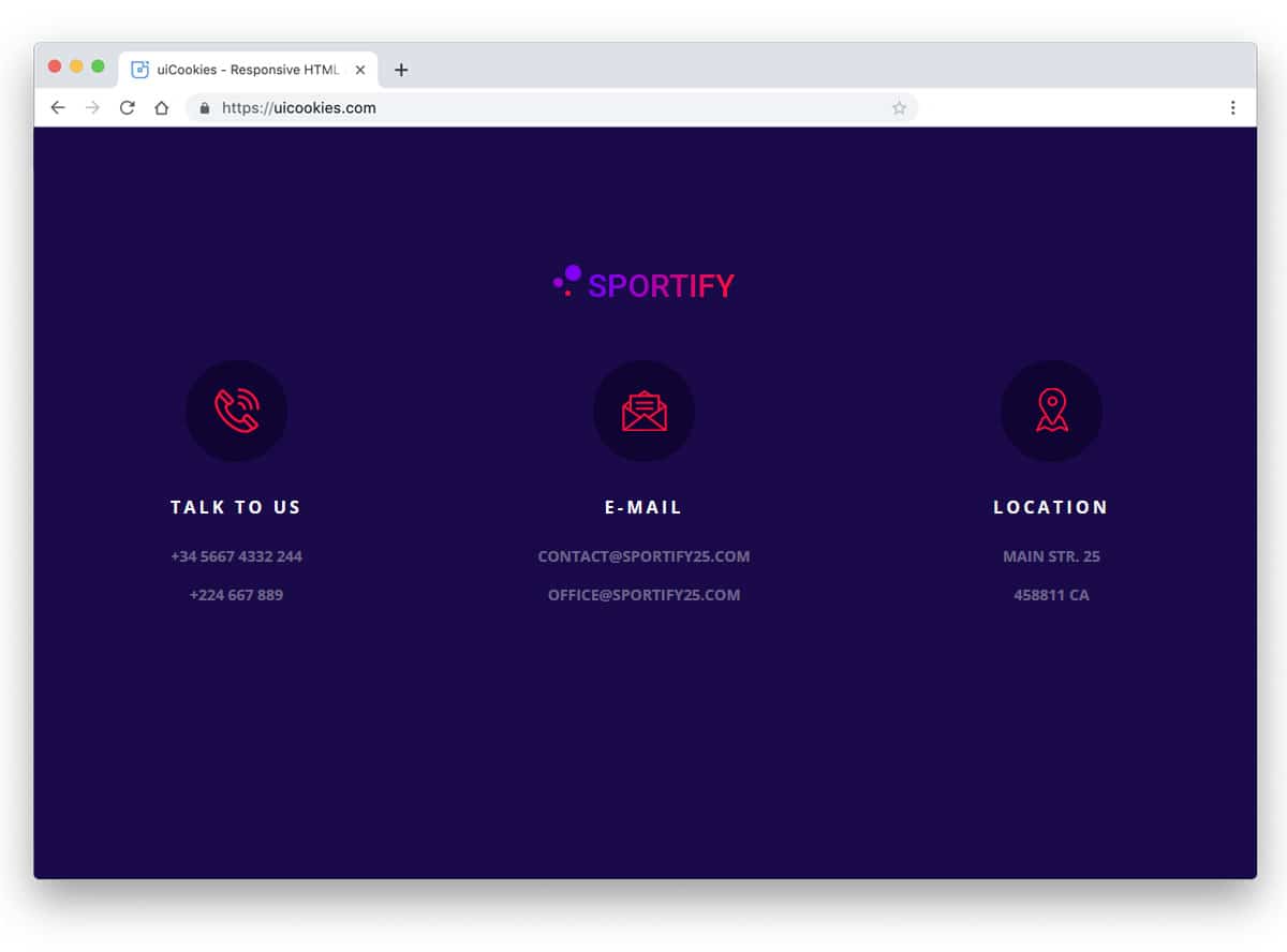
Sportify has a very simple and colorful footer section. The trendy looking three-column design neatly organize the contents. Icons are used to group the contents into location, email, and phone number. Since this one is made using the CSS3 script, you get a trendy colorful gradient color scheme. If you have to make a good looking simple footer, this example might give you some idea.
Selling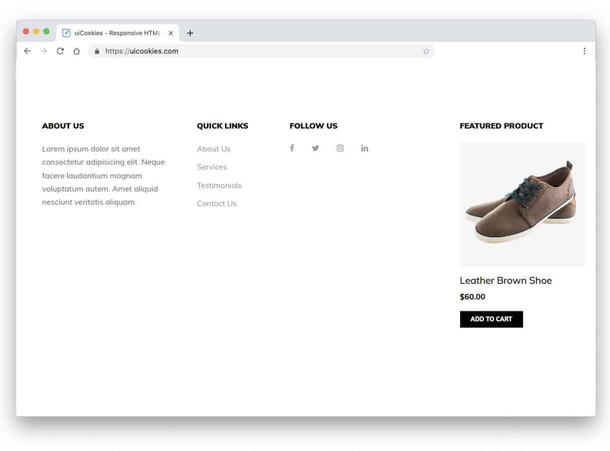
Each and every space on an eCommerce store must be able to engage the user and sell its products. In this footer example, the developer has used the space effectively to show the featured products. If you wish to show more than one product in this space, you can use a carousel. Apart from the featured product section, you have space to add other important links and an about section. If you are making an online store for a new brand, giving an about column in the footer will help the user to know about you.
WeMeet
WeMeet is primarily a fully-functional colorful website template for event websites. Throughout the template, the creator has used a colorful gradient color scheme. In the footer section also you get trendy gradient colors and design elements. If you are bored with the same old plain footer design, this bootstrap footer design will impress you. More than enough space is given between each column so that the user can easily interact with the links and other options. If you want, you can add widgets and other elements. Since it is a Bootstrap 4 based design, it can handle all present-day elements and can easily fit in all modern websites.
Bootstrap Footer Fixed-bottom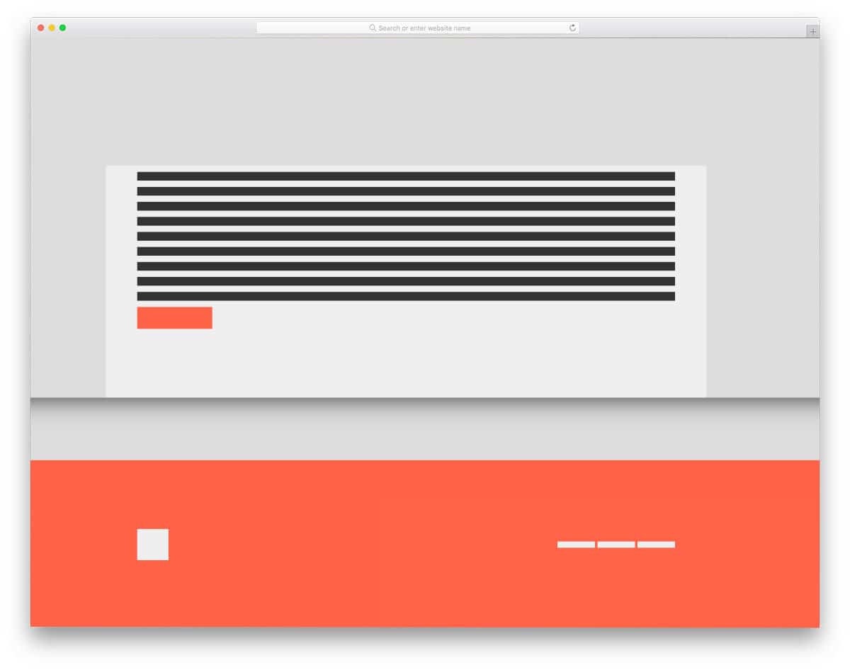
You get a skeletal webpage concept design with a fixed-bottom bootstrap footer in this example. The creator has used blocks and lines to help you easily understand the concept. As the name implies, you get a big fixed footer. Since the creator has used a full-page design, the footer has more than enough space for housing links and widgets. You can take this concept and can develop it as per your needs. If you like to spice up the footer design a bit, take a look at our CSS link style design collection. The code snippet for this entire design is shared with you on the CodePen editor. Based on your needs, you can trim the code and use it on your project.
CSS Goey footer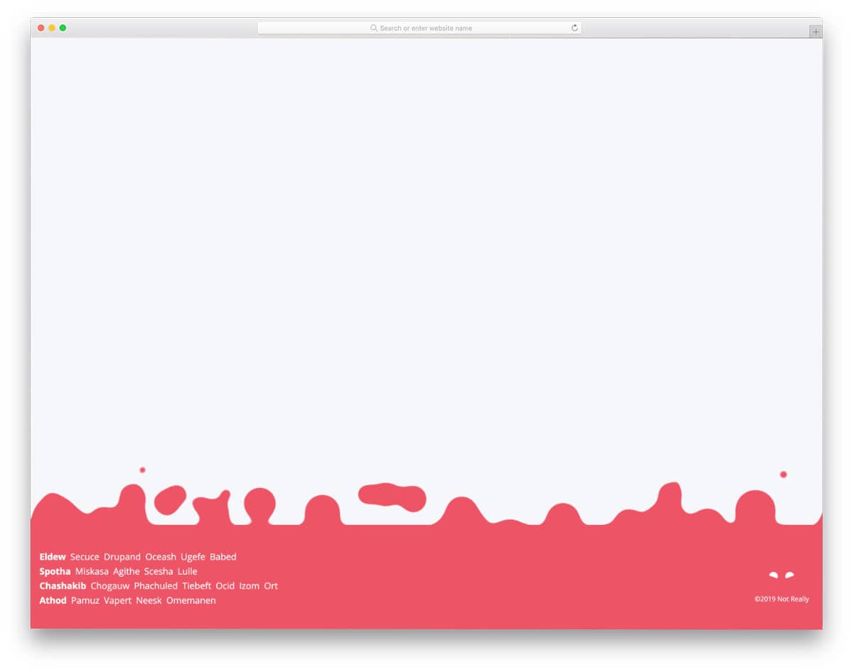
The creator has given an animated footer design in this example. As web designers and developers are consistently trying to deliver an authentic experience to the users, many new effects and designs are emerging. The CSS Goey footer is one such fresh interactive modern footer design concept. Because of the red color scheme, the bubble effect may mimic a fire burning effect. You can change the color and give a different look to the footer section. Since this design is made purely using the latest CSS script, you can use any modern color schemes and gradient colors without any worries.
Stylish Footer
Apps and modern software are trying to improve our day-to-day life. SAAS companies are adopting different strategies to let the user know how their software can change peoples' lives. If you are making a website for one such innovative companies, footer designs like this will give a more meaningful look to your website. Animated characters and pleasant vector scenery is used in the footer section. The creator has used the footer space effectively so that the links and other text content are not disturbed by the background vector scenery. You can take this concept and can create your own design based on your website needs. The whole code script is simple and light-weight; hence, you no need to worry about slow loading.
Beautiful Aurora Footer Lights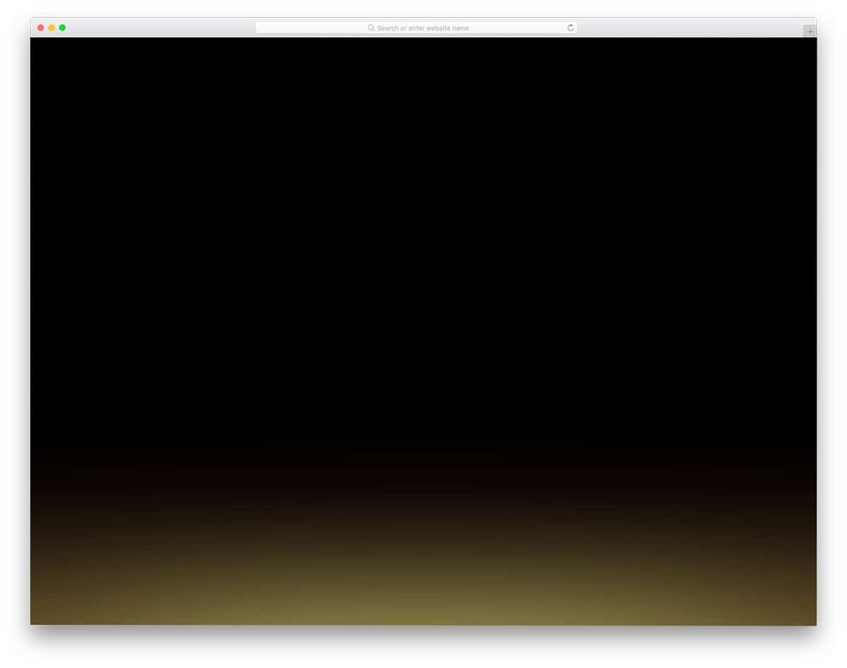
As the name implies, you get an aurora light effect in this bootstrap footer's bottom. Though the effect is simple, it manages to catch the eyes and will make the user note the footer for a second. Since this design uses the latest CSS script, the colors look natural, and the color changes smoothly to give a realistic aurora effect. The simple code structure lets the developers easily utilize the code in their project and also give them enough space to add their own custom elements and effects.
HTML CSS Mobile Responsive Footer
Those who are looking for a responsive footer design in Bootstrap 4 format will find this code snippet useful. The creator has loaded the footer with all the required elements so that users can easily navigate through the website and go to your social media profiles. Regular hover effects with simple animations are used in the default design. You can use your own custom hover effects if you want. Take a look at our CSS hover effects design collection for more interactive designs and fresh ideas.
Responsive Footer Bootstrap 4
The creator has given us a simple and clean looking responsive bootstrap footer design. All basic aspects of a footer like the page links, logo, contact information, and a short info section are covered in this example. You even have a space to add your logo in the default design. You can easily add or remove the elements by editing the code shared with you on the CodePen editor. If you are looking for an interactive and professional-looking footer section, you should consider this footer design.
Footer with CSS Grid
This footer design's micro-interaction manages to get user attention even though it is very simple. Not all websites need a big footer design, a simple footer section with social media profile links is more than enough for some personal websites. The creator has added a hover activated animated waving hand emoji near the social media links. Though this design has a plain sailing animation effect, it manages to get user attention easily. For more interactive social media icons design ideas, take a look at our HTML social media icons collection.
Parallax Footer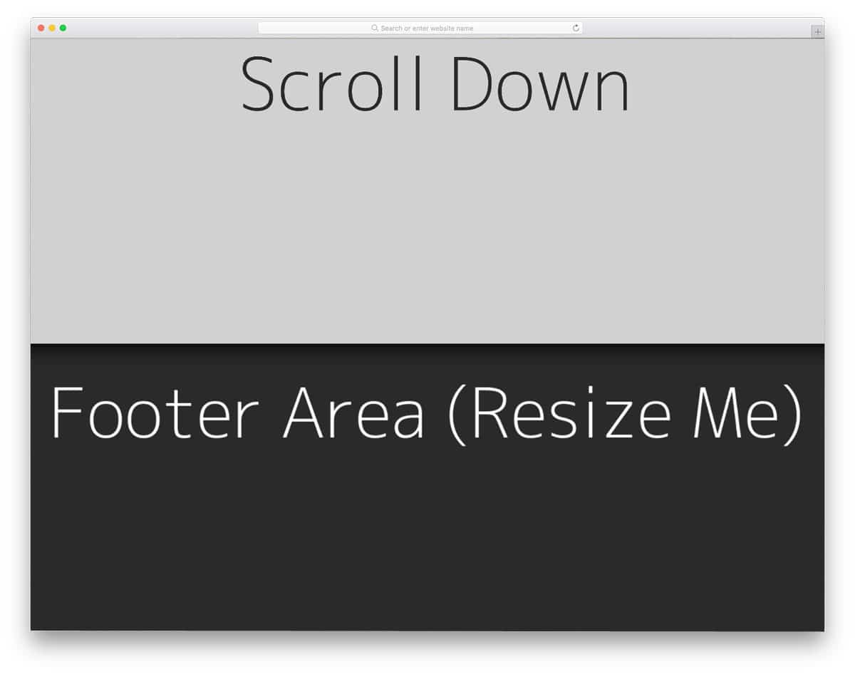
Parallax scroll effects are used widely in modern web design. If you are planning to use a parallax footer for your website, this code snippet will help you. Since the creator has concentrated on the parallax effect, you don't see a proper footer section in the demo. You can use this parallax concept in your web design. The entire code script is shared with you on the CodePen editor. You can simply edit and visualize the results on the editor before using it on your project. The default design itself is responsive up to an extent, so you can use this script to make a proper bootstrap footer.
Sticky Footer
As the name implies, the creator has created a sticky footer in this example. If you are placing important links and buttons on the footer section, this sticky footer design will be a good idea. For example, on a landing page, you can use this sticky bootstrap footer concept to show promotional content or links to take the user to your website. Another advantage of this design is it is made purely using the CSS3 script. Hence, editing and utilizing the code on your website will be an easy job for you.
Footer Template
If you are a beginner, bootstrap footer examples like this will help you easily understand the code. The creator has made this simple design using the HTML5 and CSS3 script. Because of the simple code structure, you can easily edit the code and can make it fit properly in your website design. In the default design, you can see an about section, two columns to show the quick links and categories. Hover effects are also given in this example to let the user know which link they are interacting with. At the bottom right corner, you can see social media profile icons. If you like to add effects to the social media icons, take a look at our HTML social media icons design collection.
Responsive & Clean Footer Design
This is another simple bootstrap footer design example. In this example, the creator has used a three-column design and horizontal lines to highlight the social media profile links. If you like to keep the hr line but like to tweak the design a bit, take a look at our HTML hr CSS design examples. Just like the design, the code snippet is also kept simple and neat. Hence, you can easily edit the code and add the elements and features you want. Like most other bootstrap footer examples in this list, this one is also responsive up to an extent. By making a few changes to the code, you can use this design even on your existing mobile responsive websites.
Pure CSS Classy Footer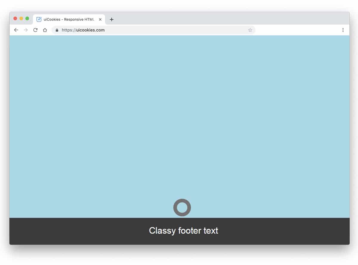
Websites designed along with strategists and marketing experts have an element which makes the user curious. For example, when you mark an option as "don't click here", obviously the user will be intrigued to know what's behind that. The same concept is used here in this footer. If you are using a dynamic footer to show personalized links, this footer example will come in handy. A small ring is placed at the footer which expands when the user hovers over it. Since it is a concept model, the designer hasn't included any link or widget in the footer. Based on your need, you can add the links and widgets you need.
Hidden Header And Footer
In this footer example, the footer appears suddenly as the user scroll and reach the end of the page. This type of footer section will work perfectly in landing pages and in news and magazine websites. In the default design, the developer has added only three boxes to add links. If you are using it for a news & magazine website, you can show subscription form and other important links. On a landing page, you can use the footer as a surprise element to show special offers and links to redirect the user to other pages on your main website. To make this smooth scrolling bootstrap footer, the developer has used HTML5, CSS3, and a few lines of Javascript.
Another Simple Footer
You don't have to make the footer special always, most of the time, a simple design is enough. In this footer example, the developer has given us a simple footer design. You can add your social media profile links, contact page links, and copyright information. The use of trendy colors for the options gives a fresh look to the footer. If you are making a colorful blog template or a personal website, this simple footer section will fit perfectly. Because most personal or portfolio websites speaks mostly about a person, you don't need a big footer section in such places.
Social Media Footer
Social media footer is another simple footer design for personal and portfolio websites. One of the main purposes of a personal website is to increase personal branding. For business websites, social media is a part of their business strategy. But for freelancers, social media plays a major role in their branding and sometimes it even brings a new project to the professionals. Hence highlighting and showing your social media links in the footer will improve the chances of increasing your followers count. In the default design, you can see that the footer is given a dark color scheme to make it look different from the main content area.
Animated Mobile Footer Menu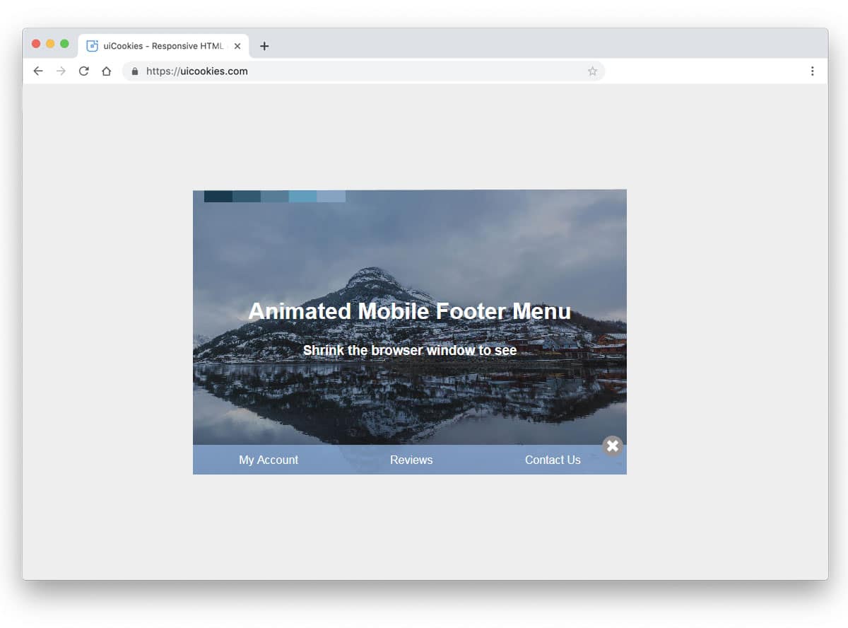
Animated Mobile Footer Menu is a fun concept for footer design. But you need to do a few adjustments before using it on your website. In the default design, the footer section appears only when you shrink the window. A small button is placed near the bottom right corner of the page to easily access the footer. If you are using the footer section effectively to show useful options in the mobile view, this smart footer design will work perfectly. To make this smart footer design, the developer has used Bootstrap4, HTML5, and CSS3 script. As this design is made using the latest web development framework you can easily use the code in your project.
Sliding Footer Menu
If you have only a few spaces to spare, this sliding footer menu will be a good choice. The developer has smartly used hover effects to show the footer menu without taking the main content area. To indicate the footer menu at the bottom, the creator has used labels. In the original design, you have only links in the footer area, but you can use other elements as well. Take a look at our HTML social media icons to add beautiful social media profile links within the given small space. Since it is a bootstrap footer design, you can easily use for responsive websites as well.
Show/Hide Footer When Scrolling
Another good bootstrap footer example for landing pages. As the name implies, the footer area is shown when the user starts scrolling the page. You can also use this footer design in blogs to show subscription form and social media follow requests. In the default design, the creator doesn't add any links or widgets. But, you can edit the code and add the features you want. Not only the design but the code structure is also kept simple for easier customization. The developer has shared the entire code in the CodePen editor. Hence, you visualize the customization results before implementing them on your website.
Bootstrap 4 Footer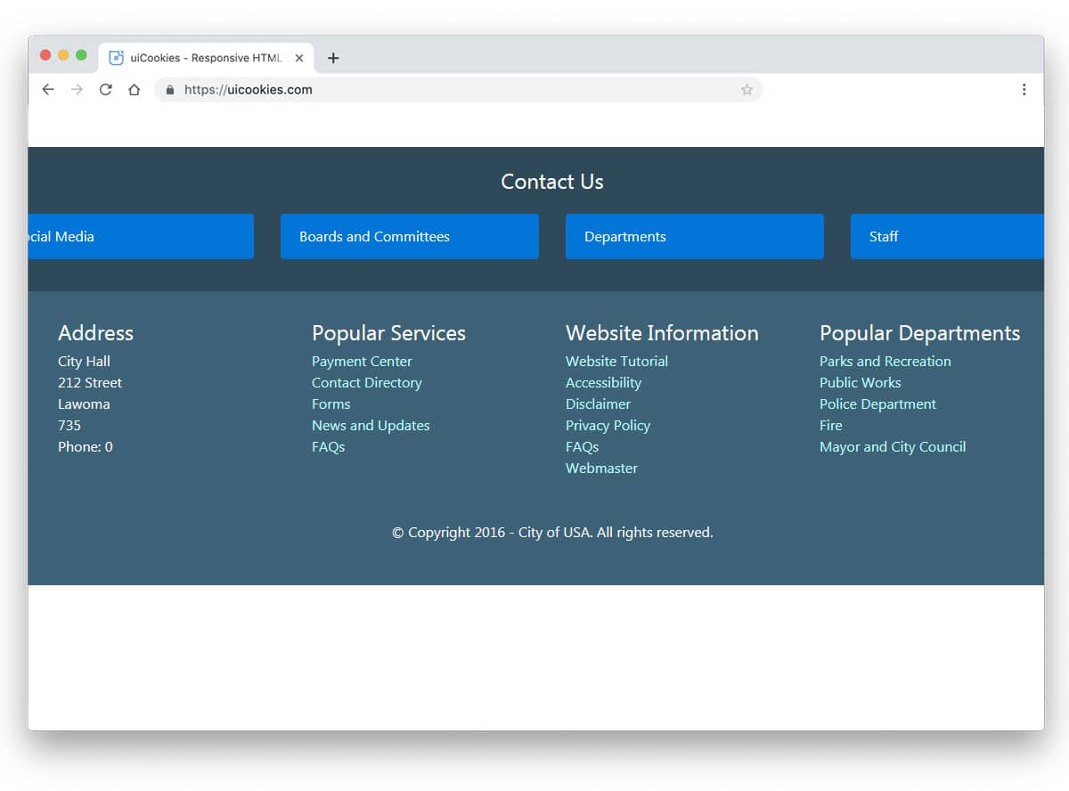
It is a regular footer which you might have seen on several business websites. For a website with multiple pages, you can't add all the pages in the navigation menu itself. We have to prioritize the menu options and need to add it important one on the navigation bar. The footer space can be utilized to add all the secondary navigation options. For example, privacy policies and term & condition pages are the least viewed pages, you can add those page links on the footer. Some website owners use widgets in the footer to give information related to the website. On travel websites and restaurant, Instagram widgets are used to show their Instagram feeds. The creator of this footer has given you a base design and you can add all the features you want.
Dark Theme Footer
In this example, the developer has given us a versatile footer design. The simple nature of the design makes it easily fit for all types of website. Ample amount of space is given to let you easily add links, social media profile links, and newsletter subscription forms. On the dark theme layout, the texts are clearly legible. Proper spacing is given between each element so that the user can click and interact without any issue. If you are focusing on email marketing, take a look at our free email templates for attractive reader-friendly designs.
Animated Footer Toggle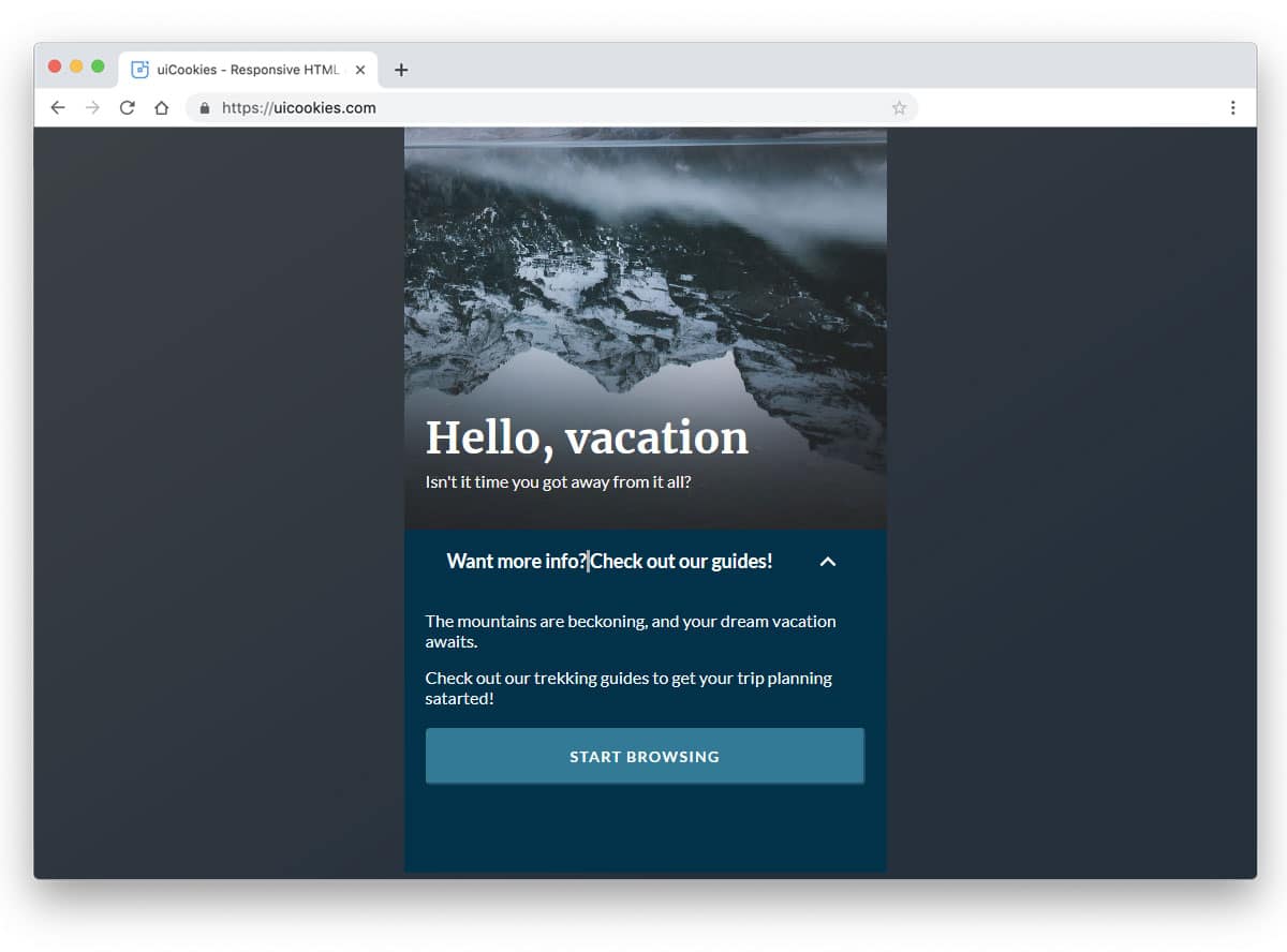
From the name itself you can understand that animation effects are used in this footer example. If you are making a landing page for your product, this footer toggle animation fits perfectly. You can add all the related contents on the main content area and related links in the footer. As AMP ads are performing better on smartphones, using a simple design like this will be a good idea. As you can see this is a very minimal template with few elements. To make this design, the developer has mostly used CSS3 and Javascript. By trimming the code as per your preference, you can use this design in your project.
Headers/Footer Parallax Effect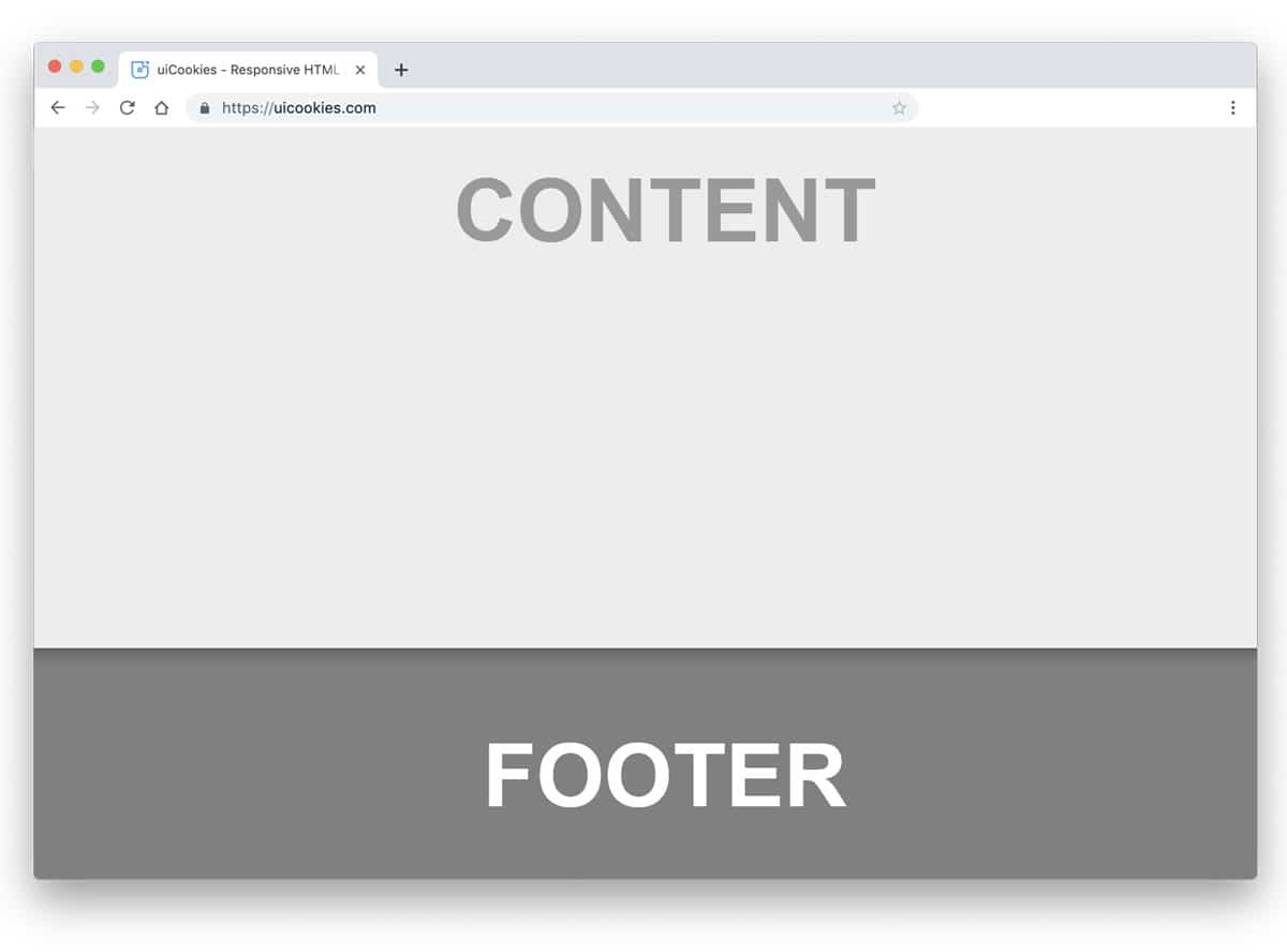
This design is almost similar to the Hidden Header And Footer section mentioned above. To make the parallax effect more evident, the creator has used shadow effects effectively. Fluid transitions will give an immersive parallax effect to the user. In the demo, the developer has given you only a basic structure, which you gives you complete freedom. By keeping this concept as a base, you can create your own design in no time. Proper handling of code structure will save your time and can add extra features without much effort.
Curved Header/Footer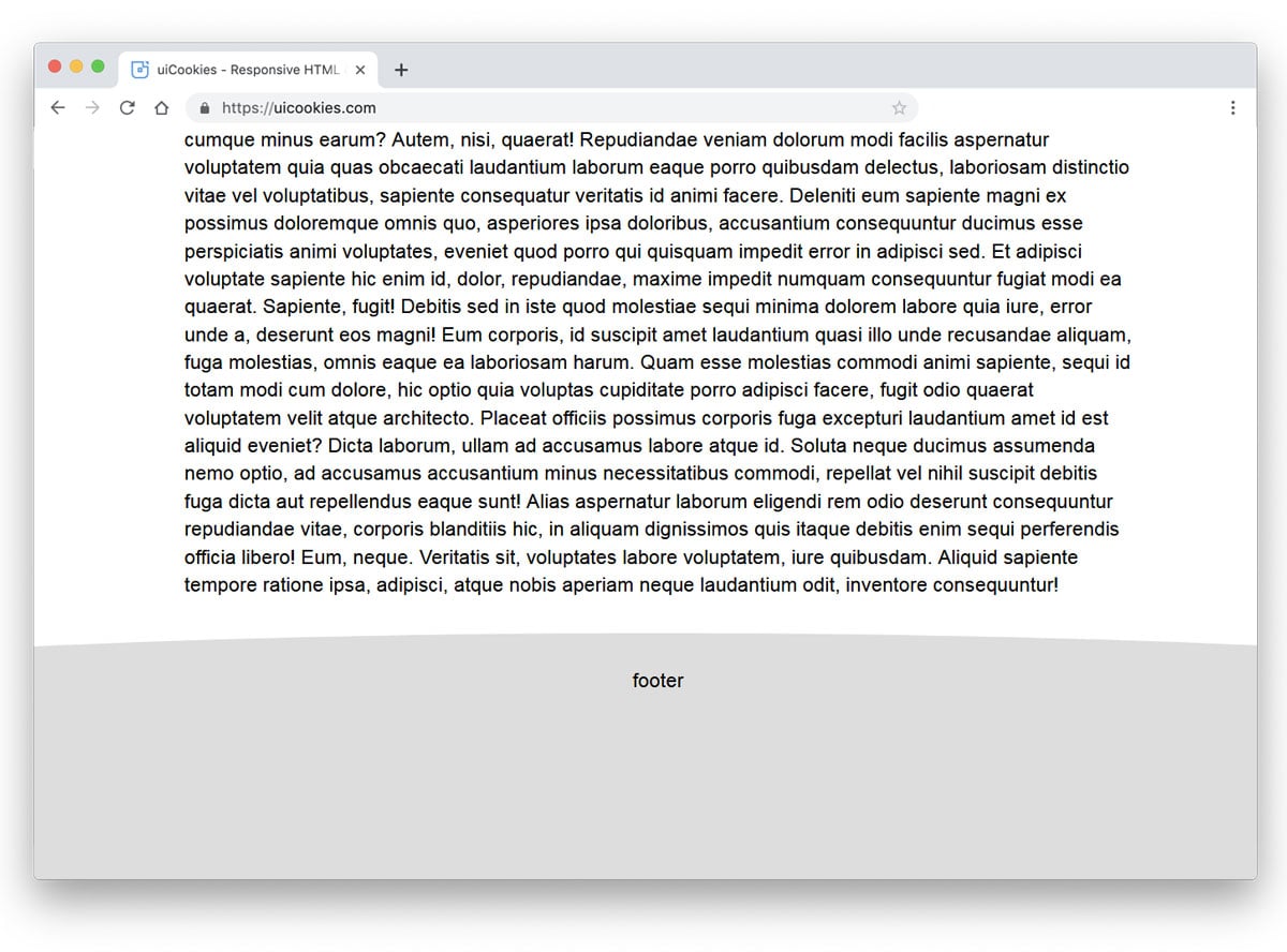
If you are bored by the same old parallel line sectioning, this curved design might impress you. One of the biggest advantages of the modern web development framework is you can bring any shapes into life. With the help of Bootstrap 4 framework, this developer has given a natural looking curved footer. Adding a little bit of elastic nature to the scrolling will make the design more lively. If you like you can spice up the design with colors and animation effects. To rev your creativity in animation, take a look at our CSS animation examples. Since the used code structure is simple, it can take the customization you do.
Light Modular Responsive Header And Footer
In this example, the developer has given us both header and footer designs. All the header and footer designs are made using the Bootstrap 4 framework. Hence, you get a properly organized and responsive footer and header designs. The code for all designs is shared with you directly so that you can easily use the code in your project. To help you understand the code easily, the developer has given notes at each part. All you have to do is to just pick the design you like and start working on it.
Three Columns Footer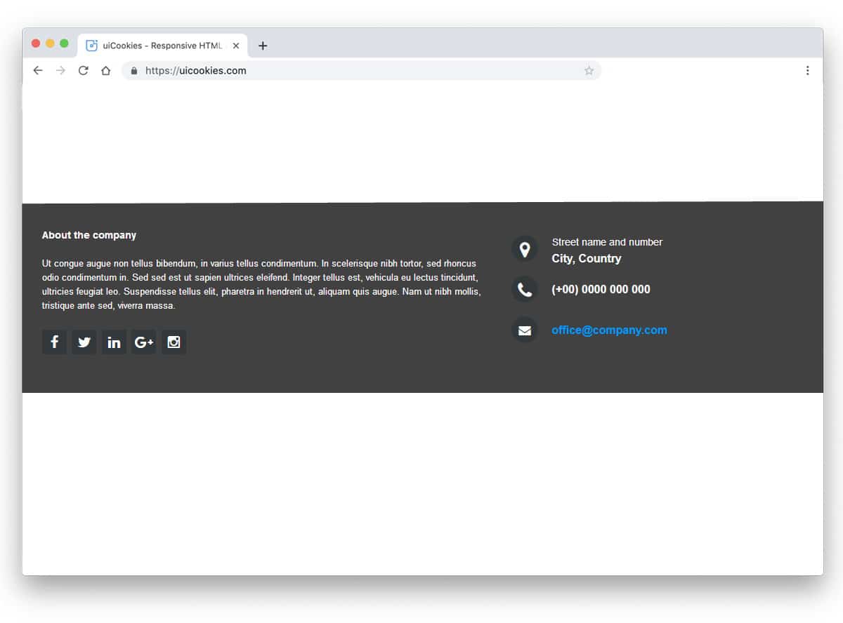
Three columns footer design is something we often see in many websites. For small websites with little pages, the three column design is more than enough. As your website grows and its purposes are slowly increasing, you can add extra columns to organize the content. Another advantage with the column design is you can organize the links easily. By keeping future updates in mind, the developer of this example has made the code structure flexible enough for easier customization. This design uses the latest CSS3 script, hence you can add trendy colors and animation effects to it without any worries.
Landing Page
The footer section of this landing page design is another example of a simple design. The basic principle of a landing page is to be short and precise. We have to add only the contents that matter. Based on your landing page goal and the strategy the design complete changes. The main content area of the landing page mostly says about your services and products. You can use the footer section to say about you and give links to other important pages to your website. If the customer is really interested in your product, they might love to know more about your company. You can use the footer section to direct the user in the right direction.
Footer Link Navigation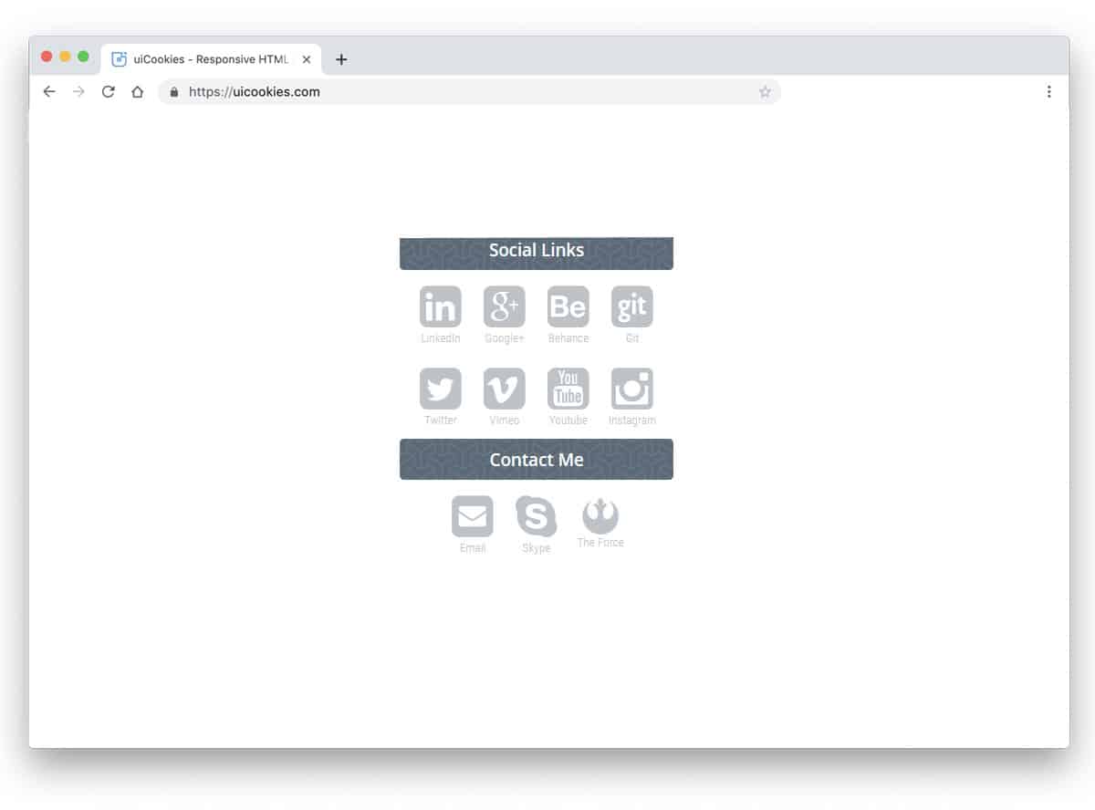
In modern web design, the fonts and icons are very expressive. Without using a single word you can let the user understand the purpose of the icon. Iconography designs are slowly becoming popular to engage the user and present the contents elegantly to them. If you are an icon design love, this footer design might get your attention. The designer has purely used icons for social media links and contacts. This simple design will work flawlessly in both desktop and mobile version. Since it is a demo, the developer has used all the icons in the footer. Based on your need, you can remove other icons and keep the footer uncluttered.
A Simple Slide-Up Footer
Giving a distraction-free environment for the users is the ultimate goal for all content-focused business website. In this bootstrap footer design, the user can see the contents on a full page and the footer section smoothly slides up as the user move towards the bottom. Not only the design concept but the code structure of this design is kept simple and clean. The developer has mostly used CSS3 and Javascript. Because of the latest frameworks, you get a buttery smooth experience.
Free Blogger templatest, Free Blogger templates Minimalist, Free blogger templates responsive, Layouts blogger, Simple free blog template, Blog template WordPress, Goyabi templates, Nawigacja na stronie, Free Blogger templates, Free Blogger templates Minimalist, Btemplates, Free blogger templates responsive, Simple free blog template, Blog template WordPress, Blogger template responsive free, Blogger templates,s Free Blogger templates Free Blogger templates Minimalist Layouts blogger Free blogger templates responsive Btemplates Blogger portfolio template Blog template WordPress Free themes blogspot Theme Blogger Premium Gratis Download Parhlo Premium/Magazine Blogger Template Google Infinite AMP Responsive Blogger Template | Blogspot Infinite AMP Sarkari Result WordPress Theme Free Download Amalia • v1.0 - Responsive •Blogger Template Amalie • Blogspot TemplateCodeify v1.0 - Personal Blogger Template new blogger templates, best blogger templatesLuvblog - Responsive HTML5 Blogger Template Twitter Bootstrap 3.0 100% Responsive DesignCream - Responsive News & Magazine Blogger Template Cream Magazine | ThemebeezSeo Mag - Responsive Blogger TemplateBest - SEO Friendly Blogger Templates • Top Best Free • New TemplatesWaverly - Personal Responsive Blogger Template250+ Best Free Responsive Blogger Templates PackNewsify v1.0 - News NEWSIFY BLOGGER THEME FEATURES Magazine Blogger Templateresponsive blogger templatesprofessional blogger templates freefree customizable blogger templatesfree blogger templates simple blogger templates freefree html blog templatesclean blogger templatespremium responsive blogger templates
Comments
Post a Comment