32 Easy To Navigate Pagination CSS Designs In 2020
Interactive pagination CSS designs for websites and applications that you can use in 2020.
Pagination plays a major role in the SEO of your website. It helps the search engine bots to easily index the articles and rank them. When it comes to pagination design we can be creative but have to keep the basic functionality undisturbed. For our own good, it is better to follow the proper pagination system and design. In this list, we have collected some of the best pagination CSS designs, which have proper functionality and good design. Some creative developers have used animation effects smartly to give a better user experience. To ignite your creativity there are some cool conceptual designs, which need proper tuning before using it in a professional design. Overall, there is a design for all your needs on this list. So make sure you check all of them before settling on one design.
Best Pagination CSS DesignsWhether you want a simple pagination CSS design or animated pagination CSS design, there is a design for you in this list.
Pagination Pure CSS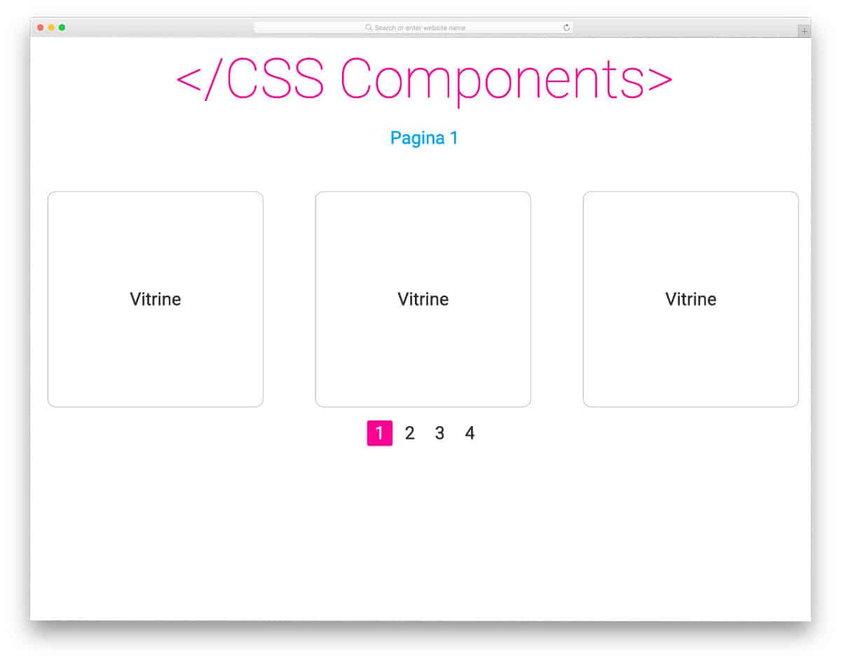
In this pagination concept, you have the option to fit many pages within a given space. This design scrolls to the corresponding page instead of loading the page. Pagination CSS designs like this will be of great use for those who want an interactive element that doesn't take much screen space. The code script of this concept is very simple, just like its design; hence, you can utilize this CSS code easily on any part of your websites and applications.
Roman Pagination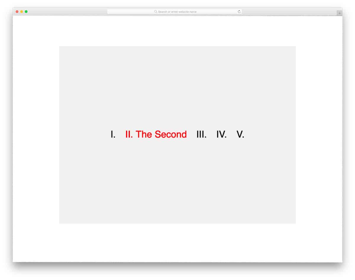
As the name implies, this concept uses a Roman pagination design. Still, wordings are used to make the message clearer to the audience. The creator has kept the animation simple in the concept to make it look professional. You can add your own custom animations if you want; the code structure is simple and has lots of space to accommodate your custom elements. Plus, this design uses the latest CSS script; hence, using modern elements and animations in this design won't be an issue for the developers.
CSS Line Follow Pagination
This example is an animated vertical pagination design. Hover effects are used to let the user know which page they are selecting. Bouncing effects are fluid, and it works smoothly to the cursor movement; hence, the user will love using this pagination design. The best part is the whole design is made using the latest CSS script. You can utilize the code and make a whole new design with the elements and effects you want. Click the info link below to see the entire code script used to make this interactive pagination design.
Gooey Pagination
Gooey Pagination is a water droplet style pagination design. The continuity of droplet movements when you hover over the pagination dots gives a unique experience. To give you such a beautiful smooth animation effect, the developer has used HTML, CSS3, and Javascript. Since it is a concept demo, the creator has not followed a proper pagination style. But you can change it easily by changing a few codes. The developer has shared the complete code script used to make this design so that other developer can easily work with this design. Few optimizations will make this design a perfect option for all modern websites.
Pagination By Rosa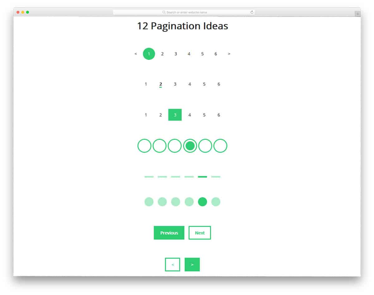
The developer Rosa has given you a 12 pagination design ideas. In this design, you get both paginations with numbers and simple geometrical based designs. All the twelve designs are just conceptual design so they don't work properly in the design. You have to work manually to add functionality and animation effects if you want. Don't worry we got you covered in the animation and hover effects. Check our CSS hover effects list and CSS animation example collection for more animation inspirations. All the twelve designs are designed using the CSS3 script, hence adding new effects to them won't be a tough job to the developers.
Dot Hopper – Pagination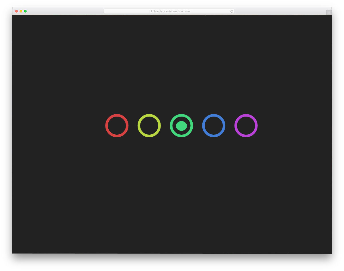
In this pagination CSS design, we get an interactive and colorful animated pagination example. As the name implies, the dot hops from one circle to the other based on the page you choose. The color transition is also handled well in this design, so the user will enjoy using this pagination. The only thing you have to keep in mind is the space you leave between the web page and the pagination. To make this interactive pagination design, the creator has used HTML, CSS, and Javascript framework. The entire code script is shared with you directly to help you easily utilize the design on your website or application.
Pure Pagination CSS Design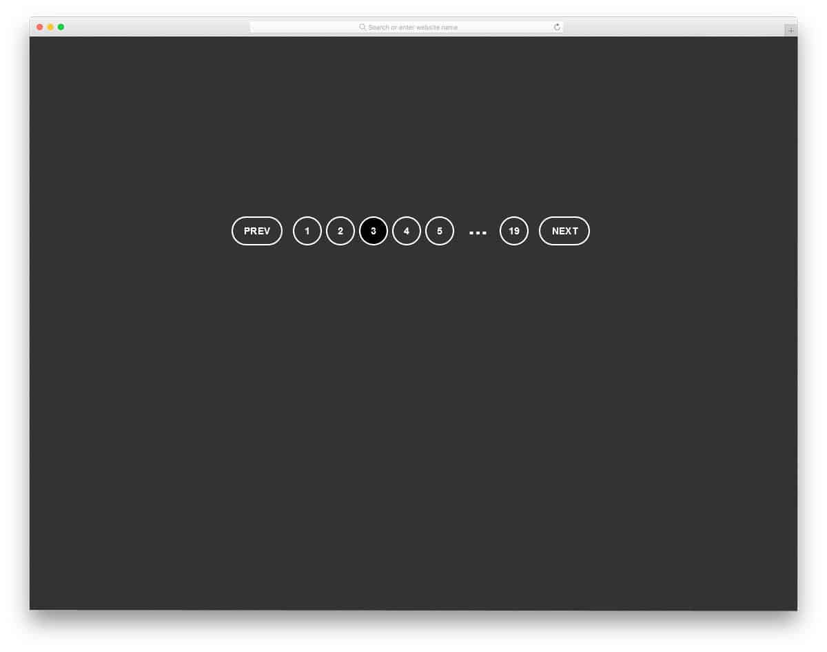
This pagination CSS design example can be used for all types of websites. Thoughtfully managed spaces and buttons will give a better user experience. Based on the page you select, the page numbers shown in the pagination varies. Hence the user can jump to the previous and next pages easily. The transition effect is not very mild in this design and this might be the area you have to work a little. Since this design is made using the HTML5 and CSS3 script, it can handle any modern animation effects.
Pagination Buttons (Pure CSS)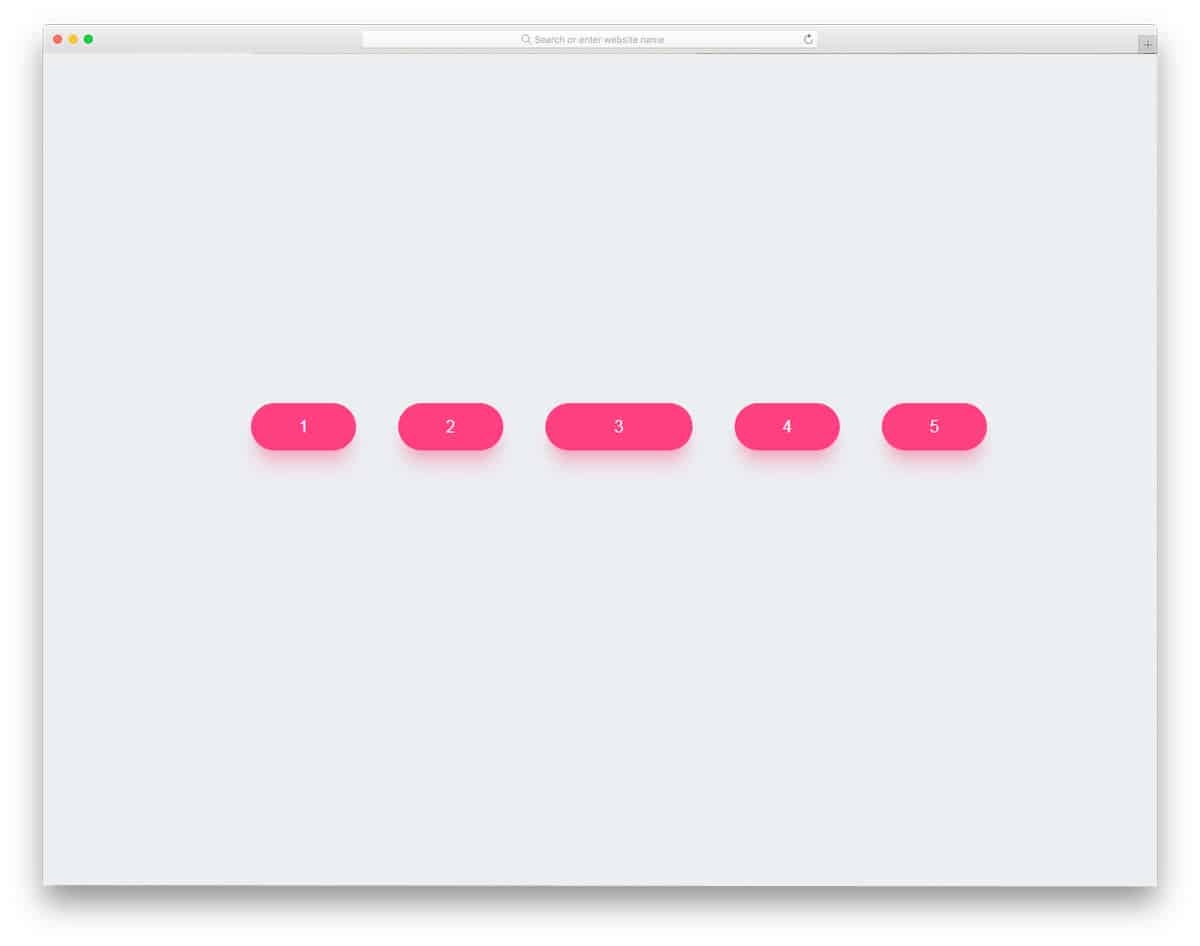
As the name implies, button style Pagination design is followed in this example. The selected page button is slightly expanded to let the user know on which page they are currently in. The expansion animation is gentle and smooth so you can use this pagination CSS design for all types of websites. Shadow and depth effects are used effectively to make the buttons stand out from the plain background. As we are talking about button design, take a look at our CSS button collection for more lively button animation inspirations.
Pagination Concept
It is an interesting pagination concept that you can apply on your website or application. For the next and previous pages, you can simply use the navigation arrows. When you need to skip to a specific page, say, for example, page number 30, you can simply click the page number and drag to the page number you want. Really an intriguing concept, especially for mobile interface designing. To let the user know about the multiple characteristics of the page button, you can add a glow or blinking effect to the button. The entire code script used to make this design can be downloaded as a file. Hence, developers can easily utilize this code.
Fancy Page Transitions And Off-canvas Menu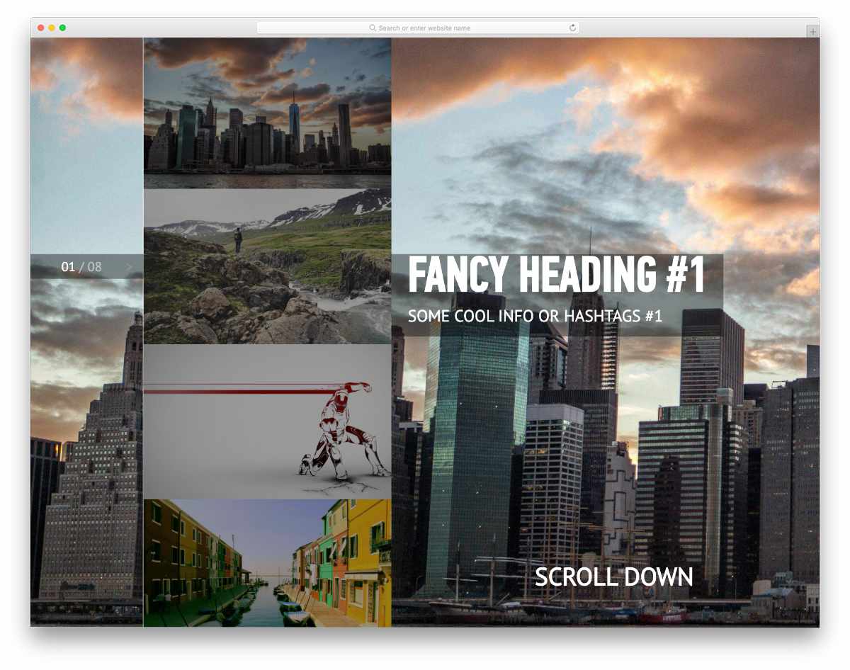
In this example, you get a pagination design idea for sliders. Instead of using the regular numbers-based pagination design, the creator has used the off-canvas effect to let the user easily jump to the page/slide they want. When you hover over the pagination, upcoming slides' thumbnail images are shown. Though this concept is used for image sliders, you can take the concept and can make your own pagination design. Since it is a fully functional image slider, the code snippet is a bit complex, but it is easy-to-understand. For more such interactive image slider designs, take a look at our bootstrap image slider design collection.
Flexing Pagination Arrows
This one is a simple and easily applicable pagination design. The creator has animated only the page navigation arrows, other than that it is a simple pagination design. As the name implies, the navigation arrows smoothly flex when you hover over it. Since the animation effect is simple and takes only a minimal screen space, you can easily fit this design on any part of your website. The whole code script is shared with you on the CodePen editor, you can trim the code as per your needs and can visualize it on the editor itself.
Clean Slider With Curved Background
It is another pagination design concept for sliders. You only get a page indicating dots in this design. Users can easily navigate through the slide either by scrolling or by using the pagination dots. The slide transition effects and the wavy background pattern gives an immersive experience. Just like the latest trendy design, the creator has used the latest web development frameworks. Hence, developers can easily work with this code.
Line Pagination with Hover
You might have seen this line hover effect in the animated navigation menu designs. The same concept is used in this pagination CSS design. An animated line is used to indicate the currently selected page. Since it is a concept model, all the functions are fully functional. You can keep this design as a base and create your own custom pagination design. Since the code script is shared on the CodePen editor, you can play with code easily on the editor itself. Speaking of navigation menus, take a look at our CSS menu design examples for more inspiring trendy looking designs.
Pagination or Navigation Links Application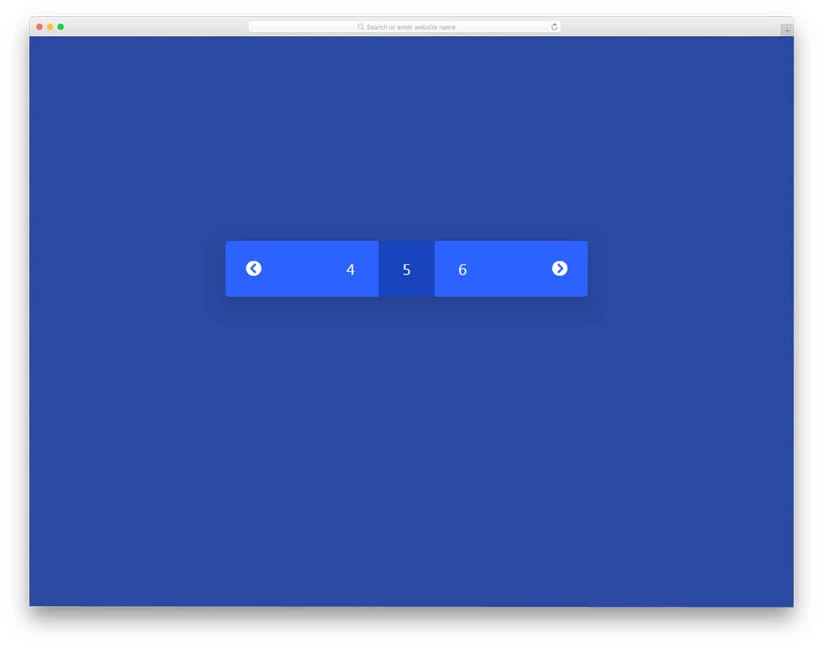
In this example, we get a simple and neat looking pagination design. Transition effects are minimal and don't take much screen space or load time. It is an ideal pagination design that you can use for both websites and applications. Though this pagination CSS design is simple the code script is a little complex. The code used to make this design is shared with you directly, hence you can easily trim the code and make it fit on your website or mobile application. Overall, this simple pagination CSS design can be used by making a few adjustments to the code and the design.
Pagination By Robert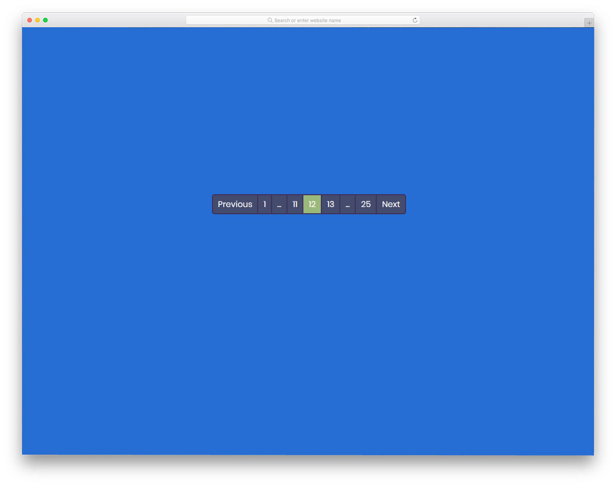
This pagination design is the one you want on a website with lots of pages. For example, in a blog template giving a proper pagination design will help the user to easily navigate around your articles. In this design, the developer has given you page ranges so that the user can easily move to the higher or lower counts. To make this properly functional pagination design, the developer has used the CSS and Javascript frameworks. Animation effects are almost nill in this design, but if you need you can add your own effect to make it unique. The practicality of this design makes it a perfect fit for content-rich websites like news websites and magazine websites.
Yeti Hand Pagination
Yeti Hand Pagination, as the name implies, there is a yeti character used in this design. When you move from one page, the yeti hand moves the marker. In the demo, it works fine, but you have to work on it to make it function properly on your website. The default design makes it a perfect option for the kids school website, that too if you are following a comical design. This design took a few extra seconds than the ordinary animation effect; Because of that, you can use this pagination design only for websites with few web pages. The developer has shared the code structure with you so that you can easily customize it.
Pagination By Vineeth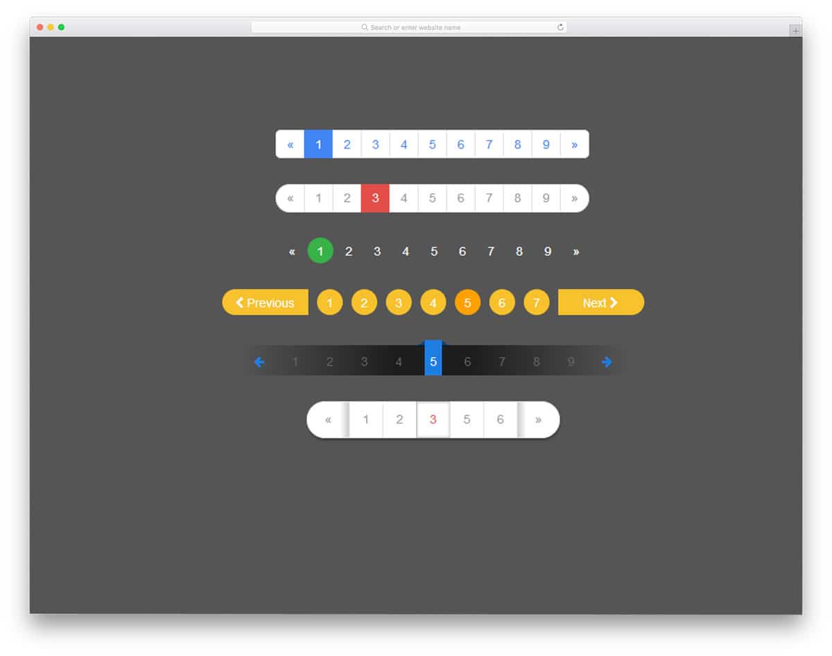
In this set also you get a group of pagination design examples. The developer has given you six pagination design. All the six animation effects are made purely using the CSS3 script. Hence you get natural colors and beautiful shapes. Though it is a CSS3 based design, it doesn't have any hover effect or animation effect. Just pick the design you like and start working on it to make it a perfect fit for your website. All the six animation effects are simple and elegant so you can use them on any type of website. Because of the simple code structure, you can use this design even on your existing website.
Pacman Pagination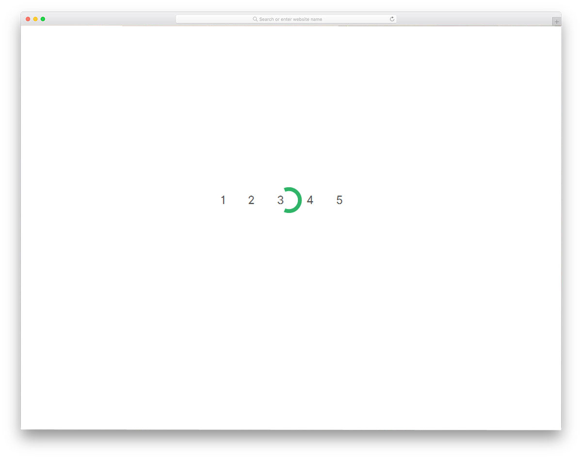
Pacman pagination is an interesting pagination design. With a simple animation effect, the developer has created an attention-grabbing pagination design. The current page indicating circle acts as a Pacman when you move to the next page; it works perfectly in both the ways so you can implement this design on your website. To make this beautiful design, the developer has used HTML5, CSS3, and Javascript framework. You can use this design as such in your gaming website design, as this one perfectly matches with the core purpose of the website. The developer has followed a proper coding structure, hence customizing it won't be a tough job for the developers.
WebDesignerDepot Pagination
This is a business style professional-looking pagination design. If you are making a minimal website template, this design will be a perfect fit. The animation effect is short and clean so that the user doesn't have to wait for a longer period of time. Another useful feature with this design is it is fully functional design. All you have to do is to use the code and work on it to function properly on your website. The simple elegant look of this template makes it a good fit for all types of website. The texts are also made bigger and sharper for easier interaction.
Infinite Pagination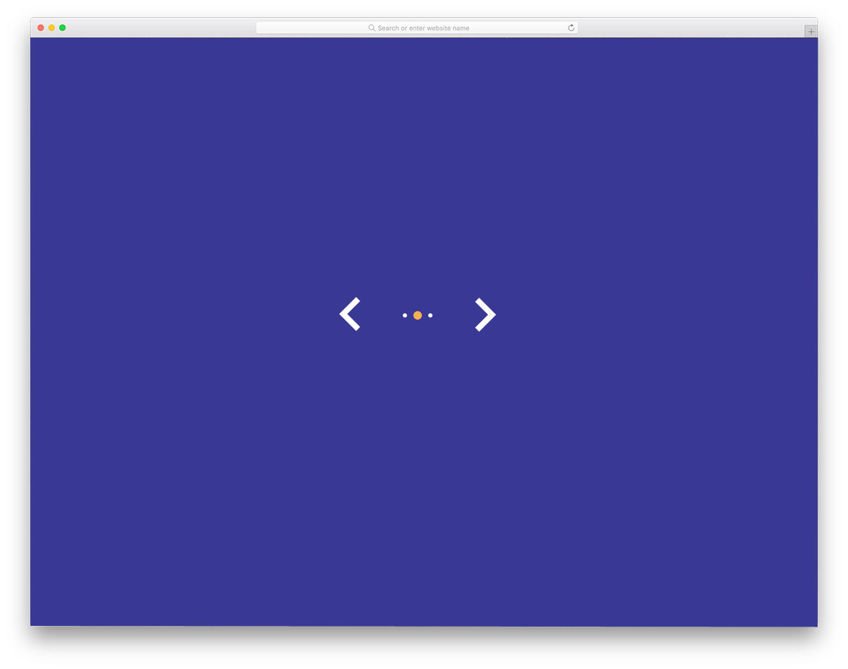
Infinite Pagination is a simple and elegant looking pagination design. As the creator has only dots in the default design, theoretically it becomes infinite pagination. If you are using this pagination style in a carousel or an image slider, it fits perfectly. But for web pages, you might need to tweak this design a bit. Because without knowing the page number it will be difficult for the user to locate their exact content. To make this smart design, the developer has used HTML5, CSS3, and Javascript. The animation is smooth and clean so that the user doesn't have to wait for the animation to complete.
Pagination & Layout With Clipped Background
If you are looking for a pagination design for your slideshow, this design will help you. In fact, you can use this design for your slideshow. The creator has used a parallel scrolling effect to present the slider contents engagingly to the users. You can either use scroll gestures to switch between the slides or you can use the pagination bat at the bottom. The pagination design is kept very simple so that it fits easily even in a small space. To make this entire slider and pagination design, the developer has used HTML5, CSS3, and Javascript. For more creative and lightweight slideshow designs take a look at our CSS slideshow collection.
Pagination By Kasper Mikiewicz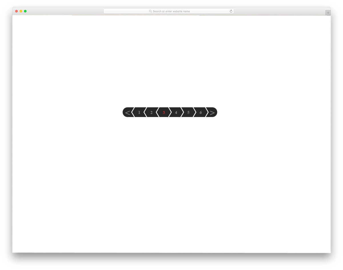
In modern web design, geometrical shapes are used effectively to create unique looking websites. When the geometrical shapes are combined with Scandinavian style design, you get a simple yet functional website design. The developer Kasper Mikiewicz, has used the arrow design effectively on the pagination bar. With a small animation effect, the current page is clearly shown to the user. As all the animation effects take place in the pagination bar, you no need to adjust the elements in your web page. Speaking of arrow designs, we have collected some smart CSS arrow design with subtle animation effects like in this design; take a look at it to get more design inspiration.
Pagination One
Pagination One is a material style pagination design concept. With simple lines and subtle hover effects, this developer has created an effective pagination design. Since it is a concept model, it is not a full working model. But, you can use this design as a base to create your own custom pagination design. The developer has used CSS3 and HTML5 scripts to make this design, hence you can use trendy colors and animation effects on this one. Ample amount of space is given for each number so that even mobile users can easily interact with the pagination design.
Responsive Magic Line Pagination
Responsive Magic Line Pagination has a line at the top of the page to indicate which page the user is using. Just like the scroll bar line, the horizontal line moves smoothly over the numbers. It is a concept model, hence the slider alone works in the demo. But, you can work with the code to make it fully functional. The developer has shared the entire code structure with you so that you can easily work with this design. To make this dynamic design, the developer has used HTML, CSS, and Javascript, based on the code structure you follow, you can trim the code.
Materialize Responsive Table With pagination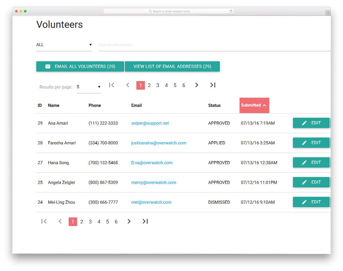
The developer Stephanie has given you a fully functional element in this design. As the name implies, you get a responsive table design in this example. All the elements and options are fully functional in this design. You even get filter and search option this design along with the pagination element. Since there is a lot of features in this design, you get a complex code structure. If you are a developer, you can easily separate the pagination code and use it. Material design is followed in this design and it looks attractive on both desktops and mobile devices. If you are designing a table element for your website to clearly organize the content, take a look at our CSS table design collection.
Tooltip Pagination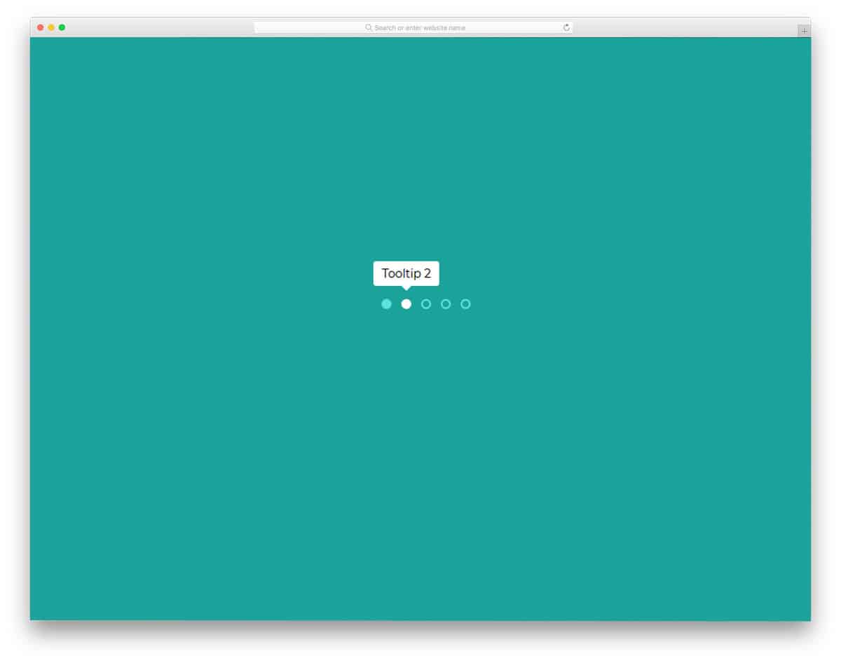
Tooltip Pagination is a plain design with dots, which you can easily use on any part of the website. This design would be the best fit for sliders and carousel or for websites with less number of pages. White dots are used to indicate the current page. Since it only uses the dots in the main design, hover effects are used to show the page detail or the number. Since it is a simple design, it is created purely using the CSS3 and HTML script. Because of this simple code structure, you can easily use this design on your existing website or application.
Pure CSS3 Responsive Pagination
In the Pure CSS3 Responsive Pagination set, the developer gives you six types of pagination styles. All the six are almost the same, the only difference is the number of page numbers you can add in the bar. Based on the available space, choose a design and start working on it. Light line stroke widths and professional animation effects make this design a perfect fit for all types of websites and applications. Since this one is designed using CSS3 script, you can use any trendy color scheme on this design. Shadow and depth effects are used smartly to differentiate important element from the background.
Pagination Hover Animation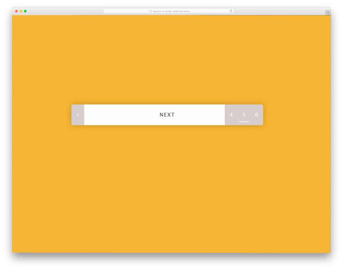
Pagination hover animation by Elena Nazarova is a practically applicable pagination design. When you have only a little space to spare for the pagination design, elements like this will be very helpful to you. The developer has utilized the animation effects smartly to give you all the basic options in one place. When you hover over the leftmost corner you get previous page number and at the rightmost corner, you get upcoming page numbers. On the page numbers also you have a small line element to indicate which page number you are going to use. This smartly designed pagination uses HTML5 and CSS3 script.
Pagination With CSS Custom Properties
In this pagination design set, you get six pagination styles. All six pagination design has different styles. The developer has used modern shapes effectively to indicate the current page numbers. Since it is a demo, you get the same color scheme for all the six designs. But, you can change the color scheme to the one you like. In this design, you get both plain style pagination and grid style pagination. All six designs are made using the CSS3 script, hence customizing and using them on your designs will be an easy job.
Pac-Man CSS Pagination
This is another Pacman style pagination design in this pagination CSS list. In the previous Pacman design, we have seen that the circular highlighter is treated as a Pacman; When the user clicks on the next page, the circular element moves forward or backward like Pacman. But, in this design, the page highlighter is itself a Pacman. The disadvantage in this design is you can't show the number clearly to the user. Plus, the Pacman in this design animates properly only when it moves forward. However, if you prefer this one than the one mentioned above, a few tweaks will make it perfect. This one is also made purely using the HTML5 and CSS3 script.
Responsive Pagination
Responsive pagination is a professional looking modern pagination style design. If you are making a colorful modern website, elements like this will add extra elegance to your design. In this design, a rounded edge border is used to hold the pagination numbers. Big colorful highlighters are used to indicate the current page. As this design purely made using the CSS3 script, using it on an existing website will be an easy job. The transition and animation effects are very subtle in this design. But as usual, you can customize the animation effects based on your design needs.
Roundie Pagination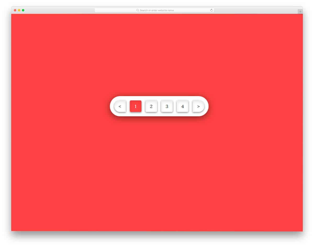
Roundie Pagination is almost similar to the Responsive Pagination design mentioned above. But, this one is bolder and flashy than the previous pagination design. Boxy elements clearly show each page numbers and other buttons. Shadow and depth effects are used to give a realistic three-dimensional button link. Plus, the shadow effects helps you to differentiate major elements from the rest of the elements. The bright red color scheme gets user attention easily. But if you are using this design on a business website, you might need to tone down the color a bit.
Free Blogger templatest, Free Blogger templates Minimalist, Free blogger templates responsive, Layouts blogger, Simple free blog template, Blog template WordPress, Goyabi templates, Nawigacja na stronie, Free Blogger templates, Free Blogger templates Minimalist, Btemplates, Free blogger templates responsive, Simple free blog template, Blog template WordPress, Blogger template responsive free, Blogger templates,s Free Blogger templates Free Blogger templates Minimalist Layouts blogger Free blogger templates responsive Btemplates Blogger portfolio template Blog template WordPress Free themes blogspot Theme Blogger Premium Gratis Download Parhlo Premium/Magazine Blogger Template Google Infinite AMP Responsive Blogger Template | Blogspot Infinite AMP Sarkari Result WordPress Theme Free Download Amalia • v1.0 - Responsive •Blogger Template Amalie • Blogspot TemplateCodeify v1.0 - Personal Blogger Template new blogger templates, best blogger templatesLuvblog - Responsive HTML5 Blogger Template Twitter Bootstrap 3.0 100% Responsive DesignCream - Responsive News & Magazine Blogger Template Cream Magazine | ThemebeezSeo Mag - Responsive Blogger TemplateBest - SEO Friendly Blogger Templates • Top Best Free • New TemplatesWaverly - Personal Responsive Blogger Template250+ Best Free Responsive Blogger Templates PackNewsify v1.0 - News NEWSIFY BLOGGER THEME FEATURES Magazine Blogger Templateresponsive blogger templatesprofessional blogger templates freefree customizable blogger templatesfree blogger templates simple blogger templates freefree html blog templatesclean blogger templatespremium responsive blogger templates
Comments
Post a Comment