32 Cordial HTML Form Design Examples For Beginners
Form designing is no longer the same, where you put a bunch of text boxes, radio buttons, and checkboxes. Based on the requirement and where you are going to use the form, the entire form design changes. Forms are the ones through which you can get to know about your customers, audience, and clients. When we design a form, we concentrate on the form design alone. But there are two important factors we miss a lot. One is the functionality and the other is the accessibility. Coding wise, yes there is a lot of best practice you have to follow to make a proper HTML form. If you are a beginner take a look at this Tutsplus post to know more about making a proper HTML form. These HTML form design examples will help you make a proper form with functionality and accessibility in no time.
Colorlib Reg Form v12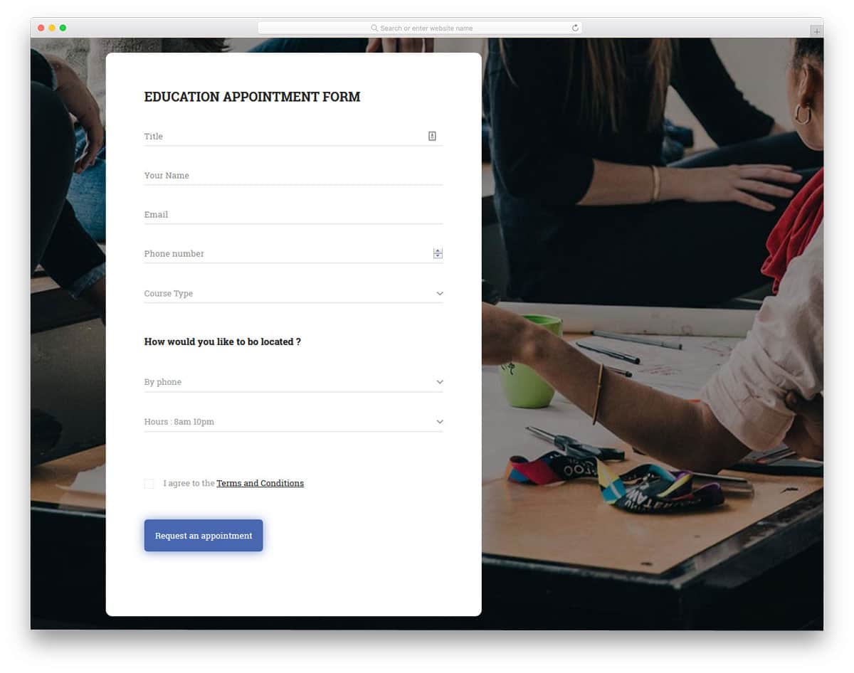
The V12 registration form is primarily an education website/app related registration form. To make the interactions easier, the creator has kept the form design long with lots of space between each form field. Dropdown options, a button to easily increase & decrease numerical value, and regular form fields are readily designed for you. The template's code structure is clean and simple, just like its design. You can easily add custom elements and effects to this form and can make the form fit your needs.
Colorlib Reg Form v14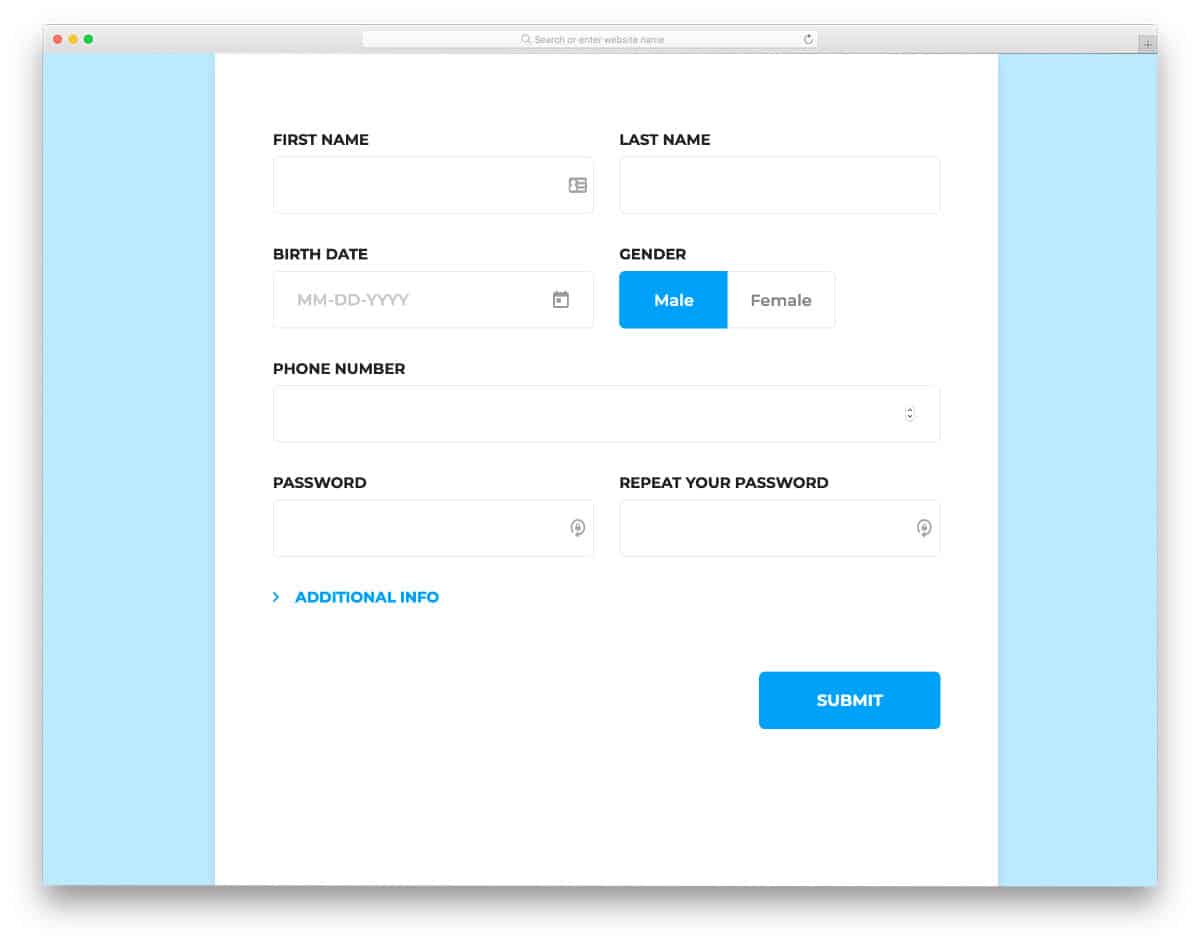
Piling questions one after the other on customers is the worst form design. But, companies do need customer detail for future needs and to strategize new marketing methods. Modern HTML form designs use several techniques to get users' information without annoying them. In this form design, you can see that the creator has wisely split the form into basic and additional information so that the user can easily decide whether they need to share the information. The entire code script is shared with you by the developer; hence, you can utilize the code and can improve the design as per your requirements.
Contact Form v3
Contact Form v3 is a sensibly designed contact form template. In this design, you get both the general contact form and inquiry form. The form smoothly expands when you switch from the contact form to the inquiry form. Texts are made bigger and bolder for better readability. It is a responsive contact form out of the box, hence you can easily add this form into your mobile responsive website. This form template is made using the latest frameworks, hence you can easily integrate this form into any modern web tools and applications.
Contact Form v4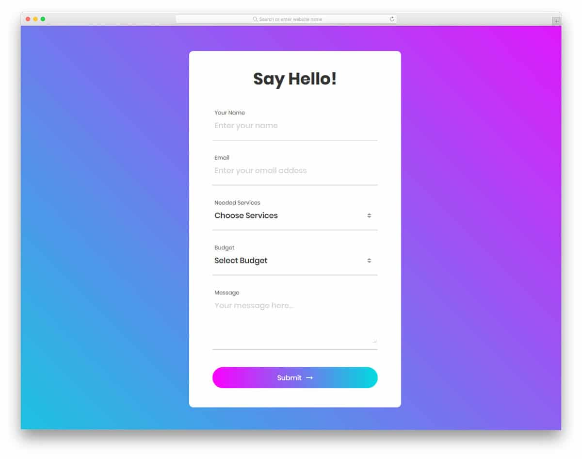
In this template, you get a long colorful contact form with more than enough form fields. The developer even gives you the choice to select options from the drop-down menu. If you have more than options, you can categorize them in the drop-down menu for a clear understanding of the options. An ample amount of space is given between each field for easier interaction. As you can see, gradient colors are used extensively in this design. Gradient colors are used for the call to action buttons and even in the drop-down menu option. All these beautiful options are made using the CSS3 script, hence you can easily use this code in your project.
Colorlib Reg Form v30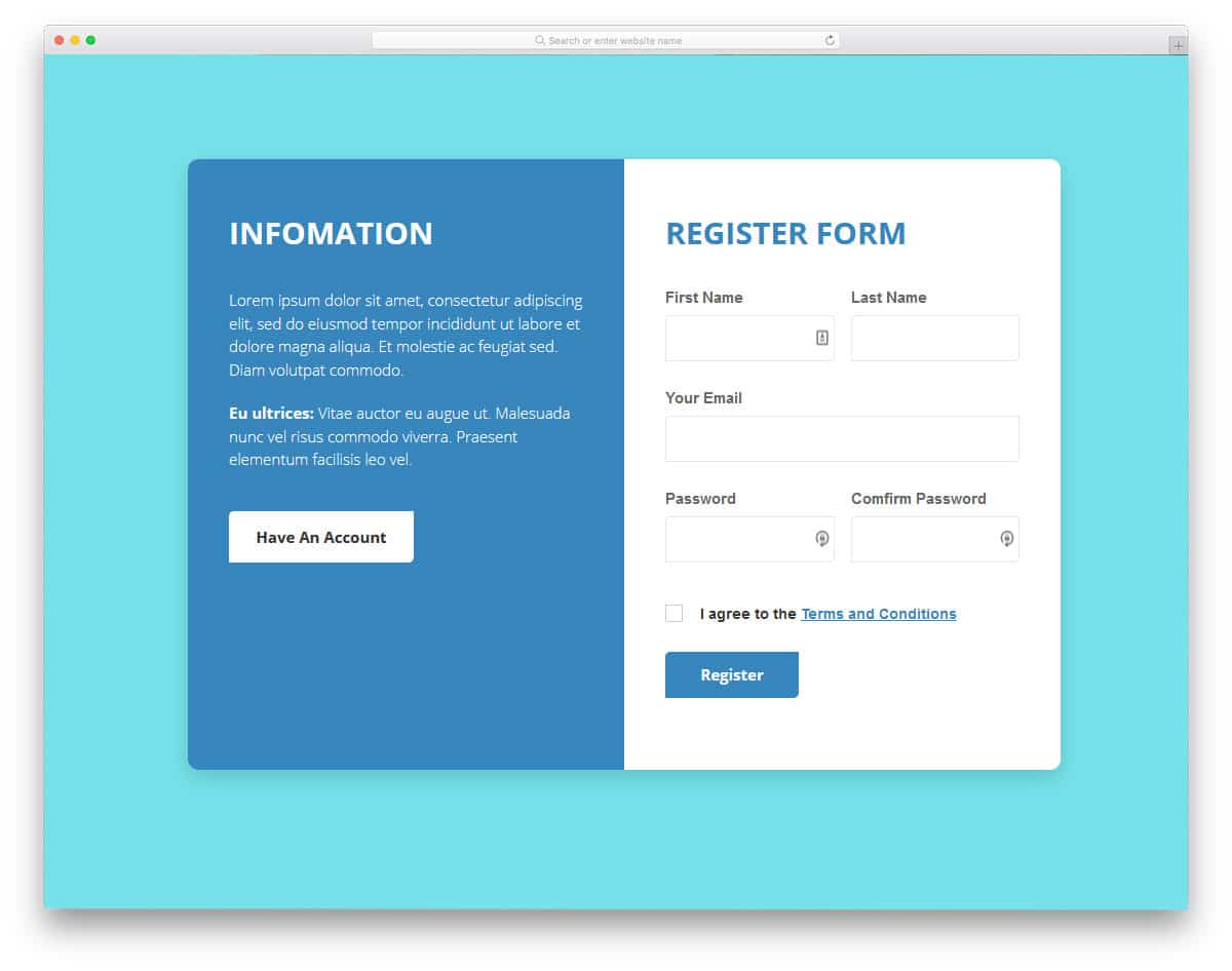
This is one of the few HTML form design examples that uses split-screen design effectively. Since it is a registration form, the creator has used one of the screens to show relevant information and a call to action button to direct the user to the login page. On the registration form, we get form fields like email address, username, and password. Basic optimizations like character hide option on the password field and error messages are pre-built in this form. All we have to do is to link this form with the registration system. HTML form design examples like this will not only make our job easy but also saves our time.
Colorlib Reg Form v29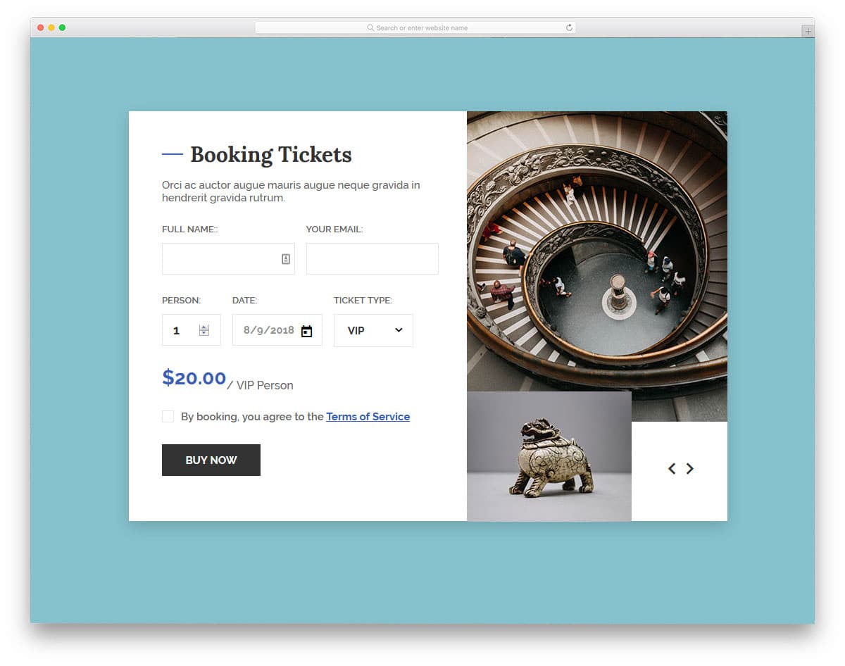
If you are looking for HTML form design examples for your ticket booking page, this form example will be a good choice. The letters are made bigger and bolder so that the user can easily interact with the form. Especially the pricing number is made bigger to clearly notify the amount the user is going to pay. On the right side screen, we have the space to add an image slider. Since it is a concept model, the creator has not added images to the slider. But, you can create an image slider manually by editing the code. For interactive transition effects and attractive slider designs, take a look at our CSS Slideshow Design collection. HTML form design examples with a versatile design like this can be used for all types of websites.
Colorlib Reg Form v28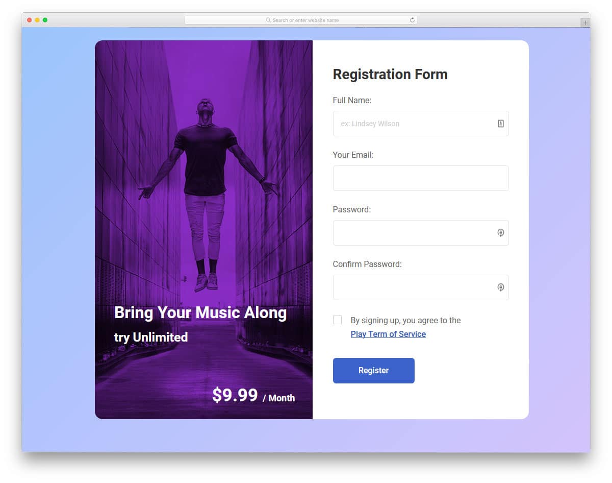
Big brands clearly mention the benefits of subscribing to their plans. HTML form design examples like this will help you show what the user gets for their money. A powerful image and a clear message will make a big change than simply putting a normal registration form on your page. Like in most other HTML form design examples, this form is also made bigger and longer so you can add form fields you want without making the form look crowded. Ample amount of space is given between each form field so the users can easily interact with the form even on their mobile devices.
Login Form 5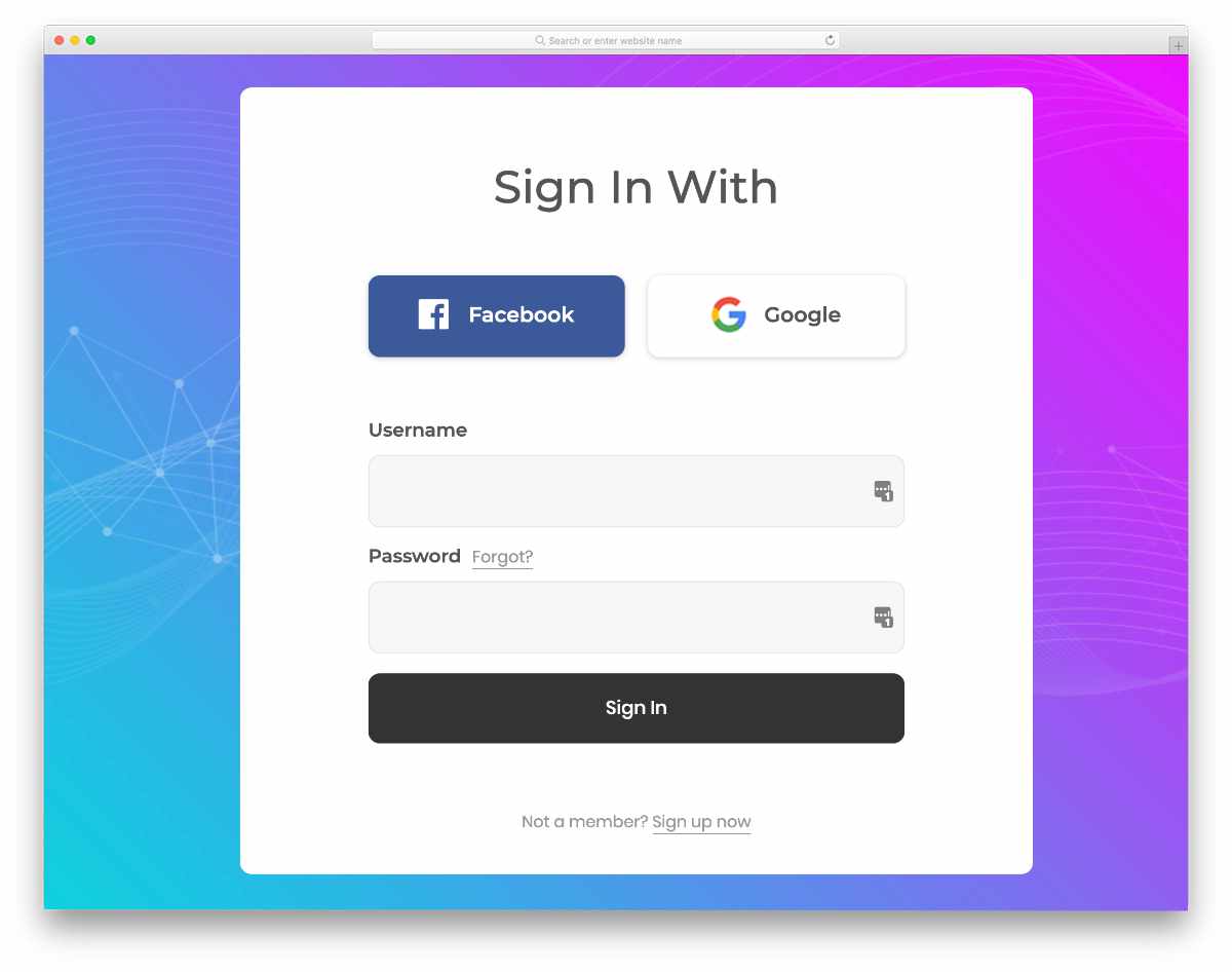
In this example, you get a colorful gradient-rich design. The creator has generously made the buttons and other elements big. As a result, you get an easy-to-interact form template. Even on small screen devices, users can interact with this form template. Important links like "forgot password" and signup links are simply given as text links to visually balance the design. If you like to spice up this text link design a bit, take a look at our CSS link style design collection. The entire code script is given in the download file to let you easily utilize this template in your project.
Login Form 4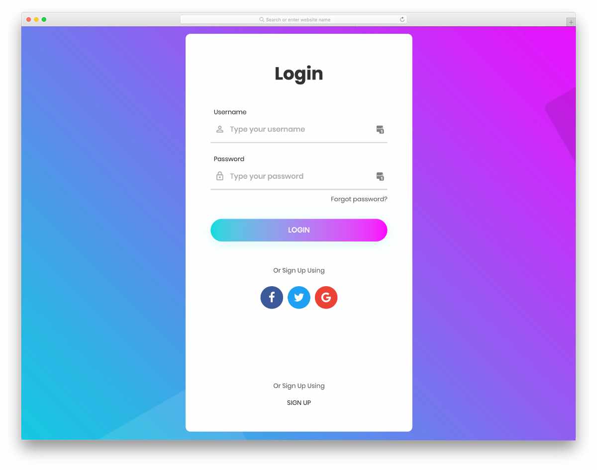
This one is also similar to the Form 5 template mentioned above. But this one is a bit elongated to let you easily fit all the elements neatly in one place. Neat hover effects and crisp icons give a premium look to this template. Though the creator has used a gradient color scheme, you can use your own colors to personalize the form as per your design needs. Signup using social media icons are placed right below the login call to action button. Since all basic front-end elements are neatly fused into this form template, you can peacefully concentrate on your custom features.
Login Form 9
Design-wise, this template is almost similar to the Form 4 template mentioned above. The creator has added a little shadow and depth effect to distinguish this template from the Form 4 template. Since the creator has used the latest CSS3 script, the depth effects are natural, and users viewing your forms on high-res screens will definitely love it. Speaking of crisp & sharp designs, take a look at our Retina Shopify themes collection to make a customer-friendly online store.
Colorlib Reg Form v15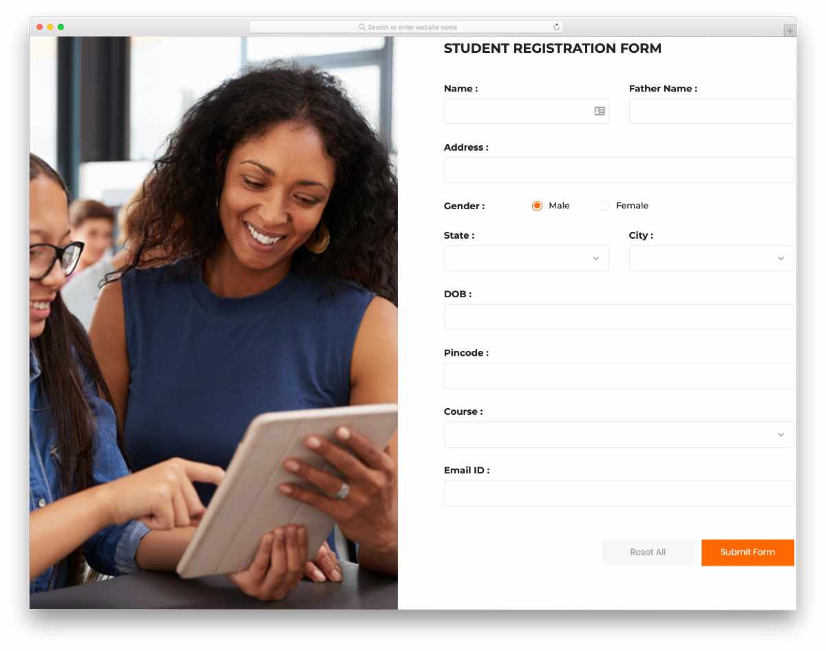
This one is a registration form design example. The creator has used a full-page form in this example. On this split-screen design, you have more than enough space to add a form on one side and an image on the other side. The creator has handled this design professionally so that you can use this registration form design for all types of websites and applications. Right from the drop-down options to the radio button, all types of essential form elements are given in this form. All you have to do is to edit the form as per your requirement and use it on your website or application.
Colorlib Reg Form v16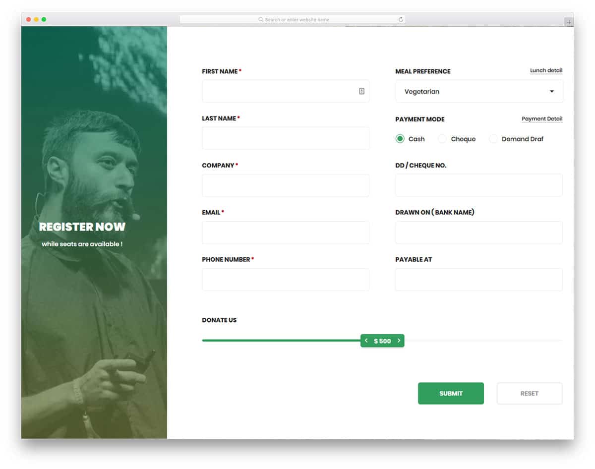
HTML form design examples with lots of useful form fields and interactive elements will help you make a user-friendly form. Since this form is originally designed for the donation page, you have related form fields and elements. The user can select the payment method, choose the program they want to donate, and a range slider to select the value. All the elements and form fields in this form are fully functional from the front side. By spending a few hours, you can easily customize this form with the elements you want and integrate with your system. For more interactive range slider design, take a look at our CSS range slider. Most of the HTML form design examples in this list are made using the latest web development framework, so they can handle modern design and animations easily.
Colorlib Reg Form v13
If you are looking for HTML form design examples with contemporary style design, this template will impress you. With a dark theme and a trendy color scheme, this template will easily fit in any luxury restaurant and hotel websites. Animated buttons and smooth text field animations have made this form template as one of the best HTML form design examples in this list. A big space is given for the image so that you can add relevant images of your hotel or restaurant. By making a few changes to the design, you can use this form for your website or application.
Contact Form v5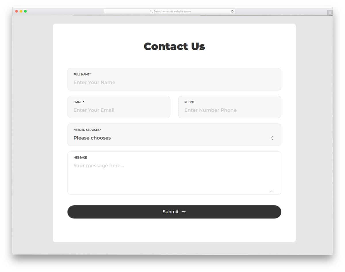
Contact Form v5 is a simple version of the V4 contact form mentioned above. If you are not a fan of gradient colors and prefer flat style design, this form will impress you. With the clean pristine design, this contact form is easy to use and interact. Apart from the clean design, this form supports field validation, when the user misses an important field, an error message is shown. All these fundamental features make this form a perfect option for business websites. By making few optimizations, you can use this contact form template even in your existing website or application.
Contact Form v1
Using focusing elements or animation is one of the important design aesthetics in a contact form designing. The user must know on which field they are entering the data. In this form, the developer has used a short color flashing animation to get user attention. The designer has followed a floating style design in this form. On the clean white background, the minimal form fields look attractive. To the left, you have a gimmicky element which moves as per your cursor movement; you can use this space to add your logo or other elements related to your website or business.
Contact Form v2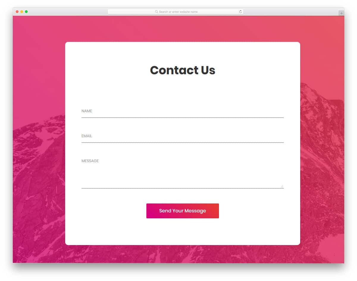
This is a simple and elegant looking form which you can use for any website or application. The simple design of this contact form makes it the best fit for multipurpose use. Form fields are made long enough to accommodate long texts in one line. In most of the contact form, the email fields are always small so that we have to move the cursor and verify the detail. Giving a long contact field like this will help the user to verify the detail easily. Form field labels are used to indicate what information to be added in that particular field. If you like to make the input field more interactive, check out our CSS input text animation collection.
Contact Form v11
Contact Form v11 is another trendy colorful contact form. Gradient colors are almost dead in the flat design era, but they are slowly coming back in the recent designs. Some designers call the present the gradient style designs as gradient 2.0 designs. Designers are using bold colors and contrast colors in the gradient to make the important elements stand out from other elements. In this design also the creator has used bold colors in the gradient, which neatly highlight the important fields and buttons on the form. Only basic form fields are given in the default design, but you can easily add as many form fields as you want by editing the code.
Contact Form v10
Contact Form v10 is a minimal looking contact form with subtle animation effects. The creator of this form doesn't use any definite contact form borders, hence you get a neat floating effect on the clean background. The form fields expand slightly to indicate which form field the user has chosen. Trendy looking fonts with bolder texts are used in this form. The default font itself looks great, but if you have your own font you can edit a few lines of the code to use your font. This simple contact form design and clean animation effect make this form fit easily in any website or application.
Contact Form v9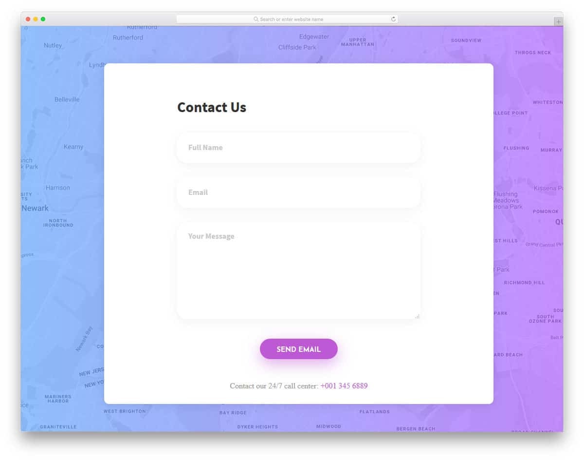
Shadow and depth effects play a major role in the modern web and app design. Without making the elements look odd, the shadow effect helps you to elegantly highlight the elements. Form fields in this contact form support field validation. On the clean white background, the bright red color error message will get user attention easily. At the bottom of the contact page, you also have space to add a contact number. If you are using this form in a hospital website, you can mention the emergency number at the contact number space. Along with the contact form you also get a fully functional Google map in the background.
Contact Form v8
Contact Form v8 is a light version of the V9 form mentioned above. The pristine design of the form helps the user to easily read the contents on the form. For better readability, the designer has used ink black texts with bolder appearance. Making elements bigger and bolder let the mobile users easily interact with your form. Though modern smartphones have bigger screens, still the chances of hitting the wrong button are higher on mobile devices. If you are using the form for sensitive functions, it is better to use confirmation message. Take a look at our jQuery confirm plugin list to easily integrate a confirmation option in your existing website.
Contact Form v7
Modern icons are very expressive and clearly convey the message to the users. Because of the clear icon design, now many brands are using iconography designs in their websites and campaigns. In this form also the designer has used icons for the form field to indicate what detail has to be given in a particular field. To make the form simple and easily fit in any environment, the designer has used a flat style design. At the end of the form, you have the option to add a checkbox for "send a copy to email". If you are using this form for inquiry purpose or service request purpose, this "send a copy to email" option will come in handy for you.
Contact Form v6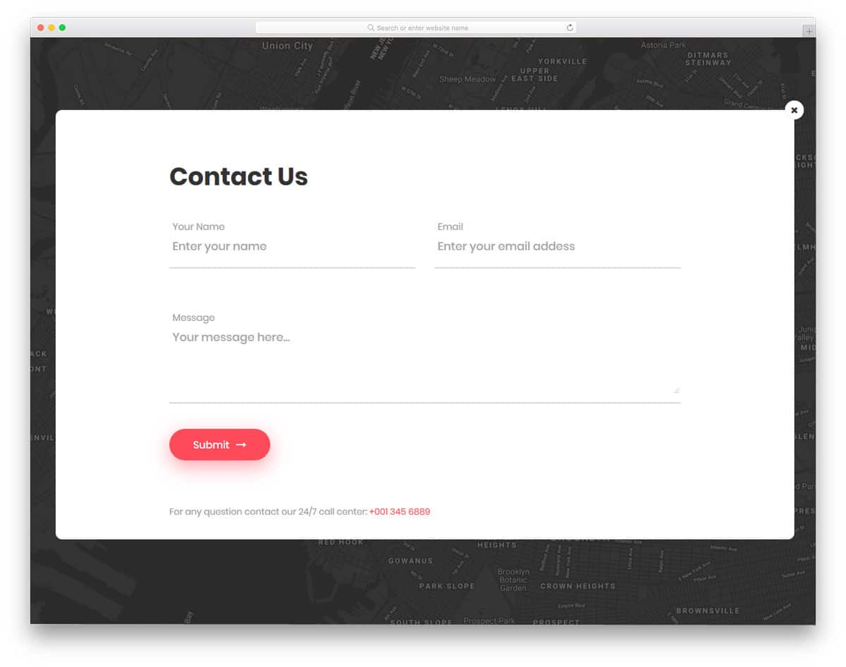
Contact Form v6 is a sensibly designed interactive contact form. The developer has used surprise elements to make this form a unique one from the rest of the HTML form design examples in this list. A blinking email icon is placed at the center of the page, on clicking the icon the form appears. This bigger form can accommodate large texts. Since this form is also from the same developer of V8 form, you get the same bold text fonts. Red color buttons and form fields looks attractive on the clea white form.
Contact Form v18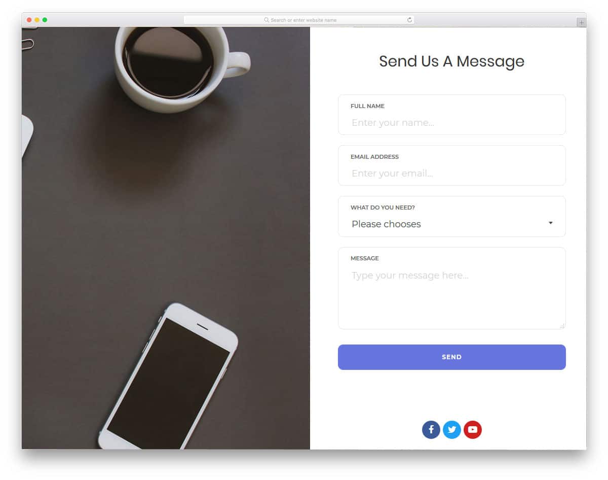
Split screen designs are always better to present engaging contents. In this form, the designer has given you a split screen design to add an image on one side and the form on the other side. You can use the image space to showcase some of your work or some related images. For example, if you are using the form in a photography website, you can add some of your best shots in the contact form. You can even add an interactive slider in the image space to add multiple images. For interactive slider design and animation, check out our CSS slideshow collection.
Contact Form v17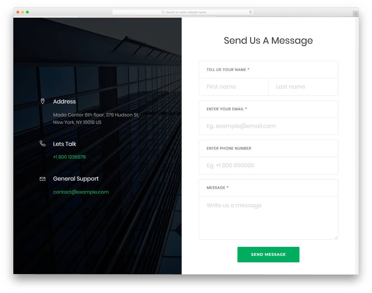
Contact Form v17 is another split screen style form design. On the image side, you have the option to add contact details and contact information. Giving multiple contact option will help the user to reach you easily in the way they prefer. As many online support providers use social media effectively for better service, you can even list your social media accounts in the contact space. Coming to the contact form design, the designer has given you a professional looking form. All the form fields are neatly labeled and swift animation effects are used to give a better user experience.
Contact Form v16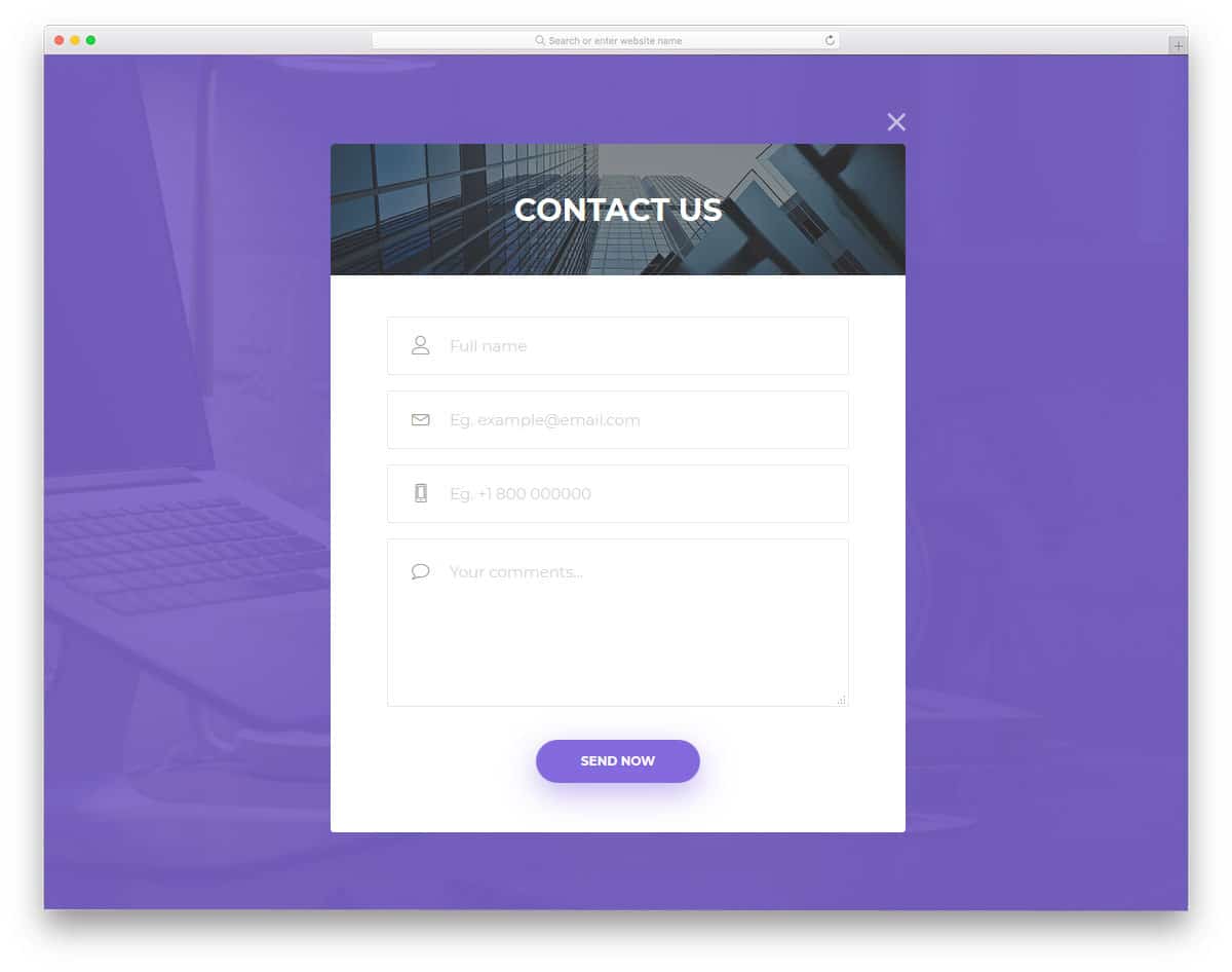
Popup windows are the best solution to clearly show the related contents when you have space restriction on the web page. As many small businesses are using one-page websites templates for their business website, elements like this will be very useful for them. In this form, the contact form opens on clicking a call to action button on the top. If you want you can use only the form in your design. The developer has kept the code structure really simple for easier and quick customization.
Contact Form v15
This simple design is functional and easy to implement on any website or application. At the top of the page, you have space to add an image background and a title. You can use the top space to add a personal note if you want. In this form design also you get a fully functional Google Map in the background. If you are using this form for a retail store or a fashion store, clearly showing its physical location will help the user easily reach your store.
Contact Form v13
The designer of this form has placed the Google Map widget on the side for better accessibility. As we always trained to see from left to right, placing the map on the left side will improve the visibility. Running an active online store will not only improve online sales but also improve the walk-in customer rate. If you are concentrating more on the walk-in customers and local audience, this form design will indirectly increase the rate of customer you like. By keeping the map widget on the form, the local customer can reach you directly and can get a clear idea.
Contact Form v12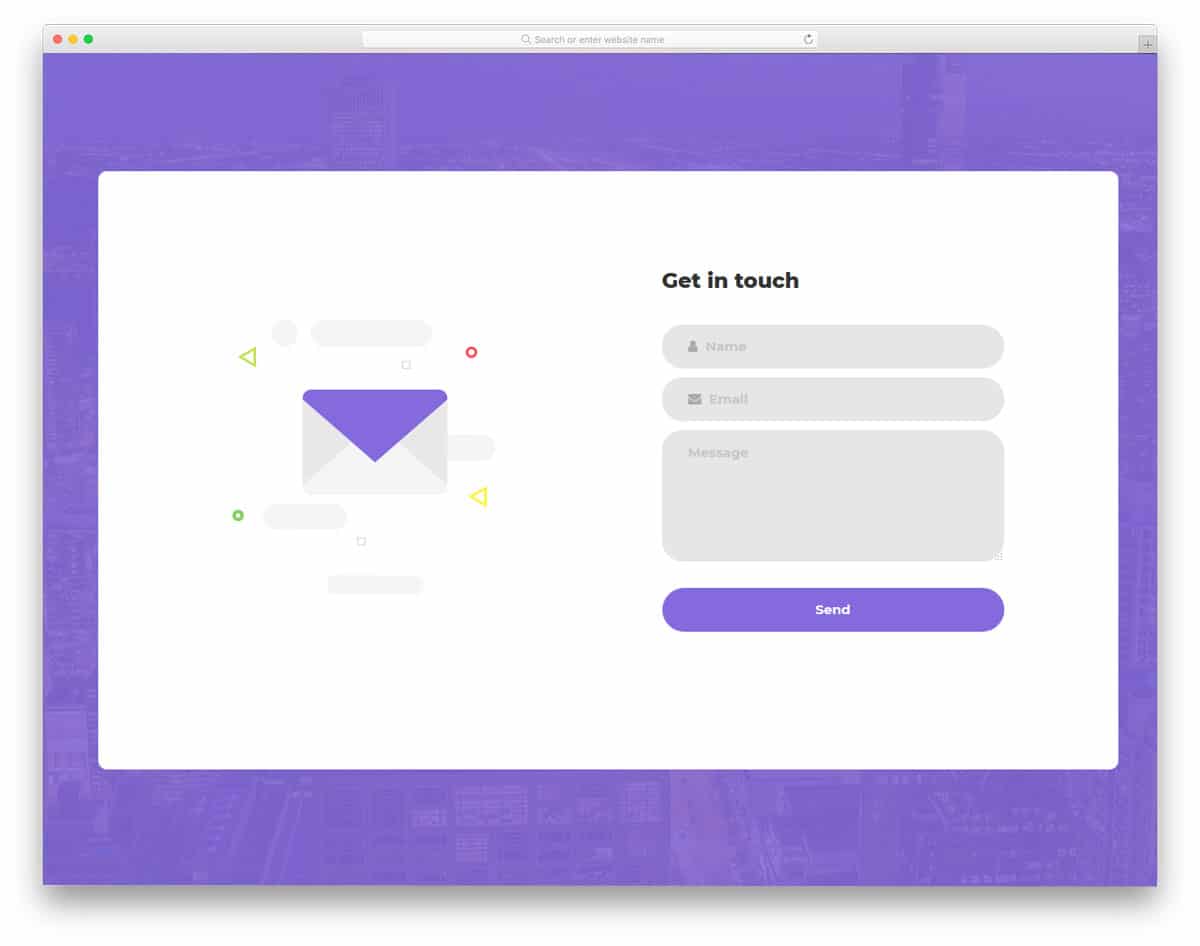
Contact Form v12 is almost similar to the contact form V1 mentioned above. In this form also you get an interactive element on the left side which moves as per your cursor movement. Color flashing animation indicates the form field selected by the user. Throughout the form, the developer has used a purple color scheme, which gives consistency in the design. If you have your own brand color, then you can use it in this form for better branding. This form uses the latest CSS3 script, hence it supports all modern colors and animation effects.
Contact Form v14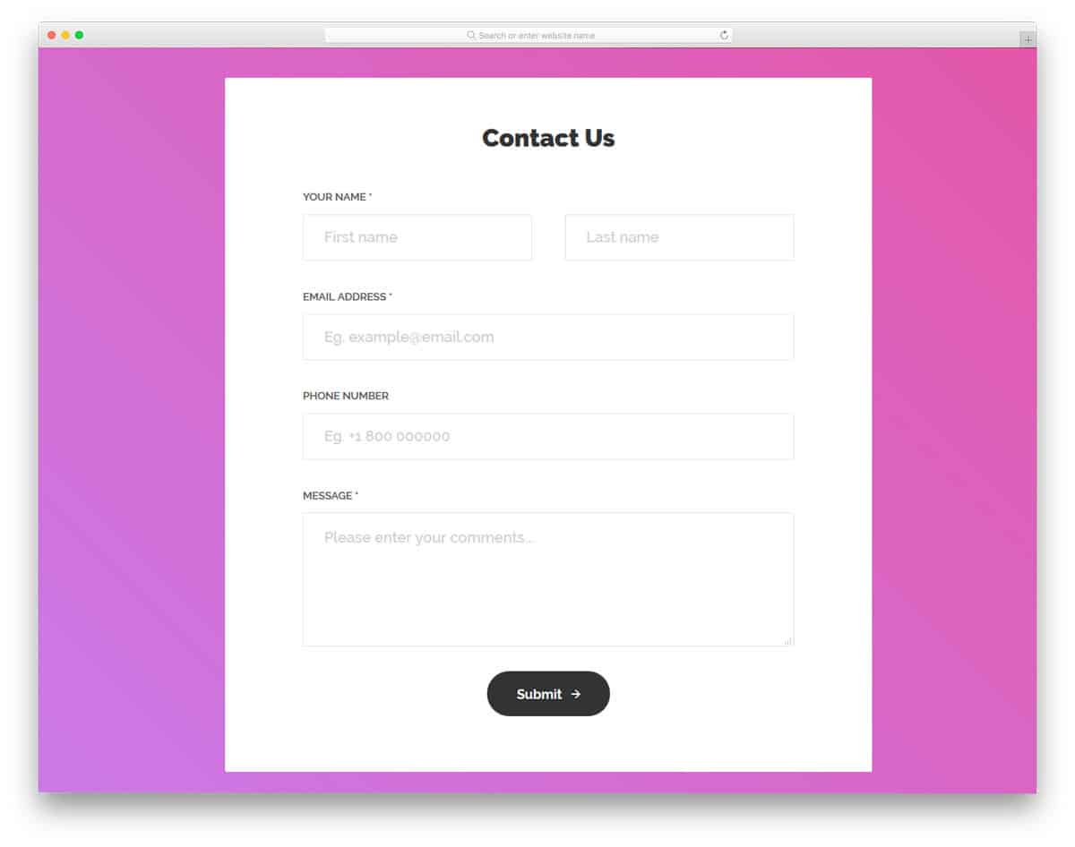
This is a properly designed contact form which has easy accessibility, better design, and useful functionalities. All the form fields in this form template support field validation. Tick and cross marks are used to indicate input data validity . If you are looking for a form design to use in a registration process, this form will be a good choice. The developer has made this as a mobile responsive form out of the box.
Contact Form v19
Contact Form v19 is a very basic contact form design. The developer has given you only two form fields in this design. A survey states that the user doesn't like to fill long forms. Adding only required form fields will help you get a better response from the user. Over the course of time at different stages of the business or process, you can get other information from the user. Since the modern user management software and CRM are powerful enough to handle information, you no need to push your customers at the first stage itself. The developer has made this form flexible enough for easy integration with other tools and software.
Contact Form v20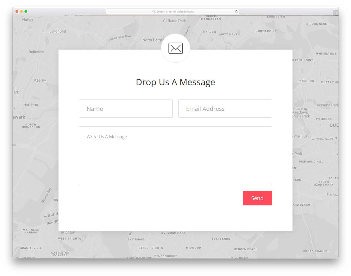
Contact Form v20 is another simple form just like the V19 form mentioned above. As the inboxes are becoming smarter, the AI sends only genuine emails to the primary folder. Others are categorized as promotional and social emails. Getting your customers name help you to land your important email on the primary inbox. In this form, the developer has given form fields for name, email address, and text message. Along with the form, you also get a Google Map on the background to navigate the user to your office location. Though it is a contact form, by making a few optimizations, you can use this form for other purposes as well.
Free Blogger templatest, Free Blogger templates Minimalist, Free blogger templates responsive, Layouts blogger, Simple free blog template, Blog template WordPress, Goyabi templates, Nawigacja na stronie, Free Blogger templates, Free Blogger templates Minimalist, Btemplates, Free blogger templates responsive, Simple free blog template, Blog template WordPress, Blogger template responsive free, Blogger templates,s Free Blogger templates Free Blogger templates Minimalist Layouts blogger Free blogger templates responsive Btemplates Blogger portfolio template Blog template WordPress Free themes blogspot Theme Blogger Premium Gratis Download Parhlo Premium/Magazine Blogger Template Google Infinite AMP Responsive Blogger Template | Blogspot Infinite AMP Sarkari Result WordPress Theme Free Download Amalia • v1.0 - Responsive •Blogger Template Amalie • Blogspot TemplateCodeify v1.0 - Personal Blogger Template new blogger templates, best blogger templatesLuvblog - Responsive HTML5 Blogger Template Twitter Bootstrap 3.0 100% Responsive DesignCream - Responsive News & Magazine Blogger Template Cream Magazine | ThemebeezSeo Mag - Responsive Blogger TemplateBest - SEO Friendly Blogger Templates • Top Best Free • New TemplatesWaverly - Personal Responsive Blogger Template250+ Best Free Responsive Blogger Templates PackNewsify v1.0 - News NEWSIFY BLOGGER THEME FEATURES Magazine Blogger Templateresponsive blogger templatesprofessional blogger templates freefree customizable blogger templatesfree blogger templates simple blogger templates freefree html blog templatesclean blogger templatespremium responsive blogger templates
Comments
Post a Comment