28 Bootstrap Animation Examples To Make A Meaningful Design
Animations help us to relate to the audience easily. Whether we are making an illustrative design with complex animation or a normal website with simple animation, it adds life to the website. Though animations are good for interactions they tend to slow down the website a bit. But with the modern web development framework, we can make an interactive light-weight website easily. If you are looking for creative Bootstrap 4 animation examples to add meaning to your website, this list will rev your creativity.
To make this list useful for you we have included bootstrap animation examples for almost all common web elements. Take your time, check all the examples, and find inspiration for your design. Most of the developers have shared the entire code script with you to let you easily utilize the code.
Here are the best bootstrap animation examples to add life to your designs:
Organic Shape Animations
Organic shapes are used extensively in modern web design. Instead of using the same old shapes, you can use organic shapes based on your design concept and space. Thankfully the modern web development frameworks help you create any shapes easily. You can add animation effects to these organic shapes to liven up the design. In this organic shape, bootstrap animation examples collection, the creator has given different types of organic shapes. All animation effects are very fluid and simple so that you can use them on any type of website. The animation effects are so smooth; hence, you might even remember amoebas that you have seen under microscopes during your school and college days.
Scrolling Letters Animation
Letters are treated as a part of the design nowadays. Modern typographies have unleashed many creative ideas for the developers. One such creative idea for the letters is this scrolling letter animation. This bootstrap animation on scroll best fits in interactive homepage designs and in modern one-page website templates. As you scroll down the page, the letters change according to the section title. The letters are made bigger and are kept at the lower-left corner of the screen to make it unobtrusive when the user reads your webpage content. You can easily change the text font and size to fit your needs.
Decorative Letter Animations
This is another typography animation example. Modern creators use typographies as a decorative element for content-focused websites to deliver an engaging user experience. In this example, the creator has given different bootstrap animation examples for texts. The default design makes it a perfect option for the slider concept as well. This bootstrap slide animation can be used for interactive menu and category option listing as well. The entire code script used to make this design is shared with you so that you can easily edit the code as per your needs. If you want, you can use the designs as such by making a few optimizations to the code.
Bootstrap Product Page Animation
Online stores are becoming livelier, and developers try different techniques to make the shopping experience engaging for the users. In this example, the creator has used swift product page animation to present the product elegantly to the audience. Since the animation is short and simple, you can use this animation even in a shopping app. The only thing you might need to add in this animated shopping concept is the product image carousel; Other than that, everything works smoothly. Take a look at our bootstrap carousel design collection for a more interactive design that goes well with this animated product page design.
Button Selection Type
This animated button design might come in handy in many modern web applications and mobile app UI designs. This button is designed to select different options without any unfolding animation or checkbox element. The rubber band effect when the options change gives a realistic touch to the design, plus, the user can easily note that the options within the button are changing. If you have only a limited amount of screen space and have to list a few options, animated buttons like this will take your design to the next level. The creator has used a few javascript in this bootstrap animation to make the animations fluid.
CSS Animations with SVGs
This bootstrap background animation might help you make a lively homepage header section. Using animated header sections tends to get user attention more easily than other types of header designs. This light-weight background animation keeps the design simple and also loads faster. Hence, you don't have to change the design or the code when you work on the mobile responsiveness. Since this theme uses the latest CSS script, the colors look vibrant, and the animations look very natural. If you are ok with this background animation, then you can use this code snippet in your design without any issues.
Submit Button
Micro animations are taking user experience to the next level. Modern designs use animation effects to add meaning to the design. For example, in this example, the creator has clearly shown that your information is sent to the server. The creator has kept the progress bar animation as sleek as possible so that the user doesn't have to wait much. For smooth animation and fluid transitions, the creator has used both CSS and Javascript frameworks. Because of the simple animation and compact design, you can use this concept on any part of your website. The entire code script is shared with you on the CodePen editor; hence, you can easily edit and visualize the results before using the code on your design.
Snake highlight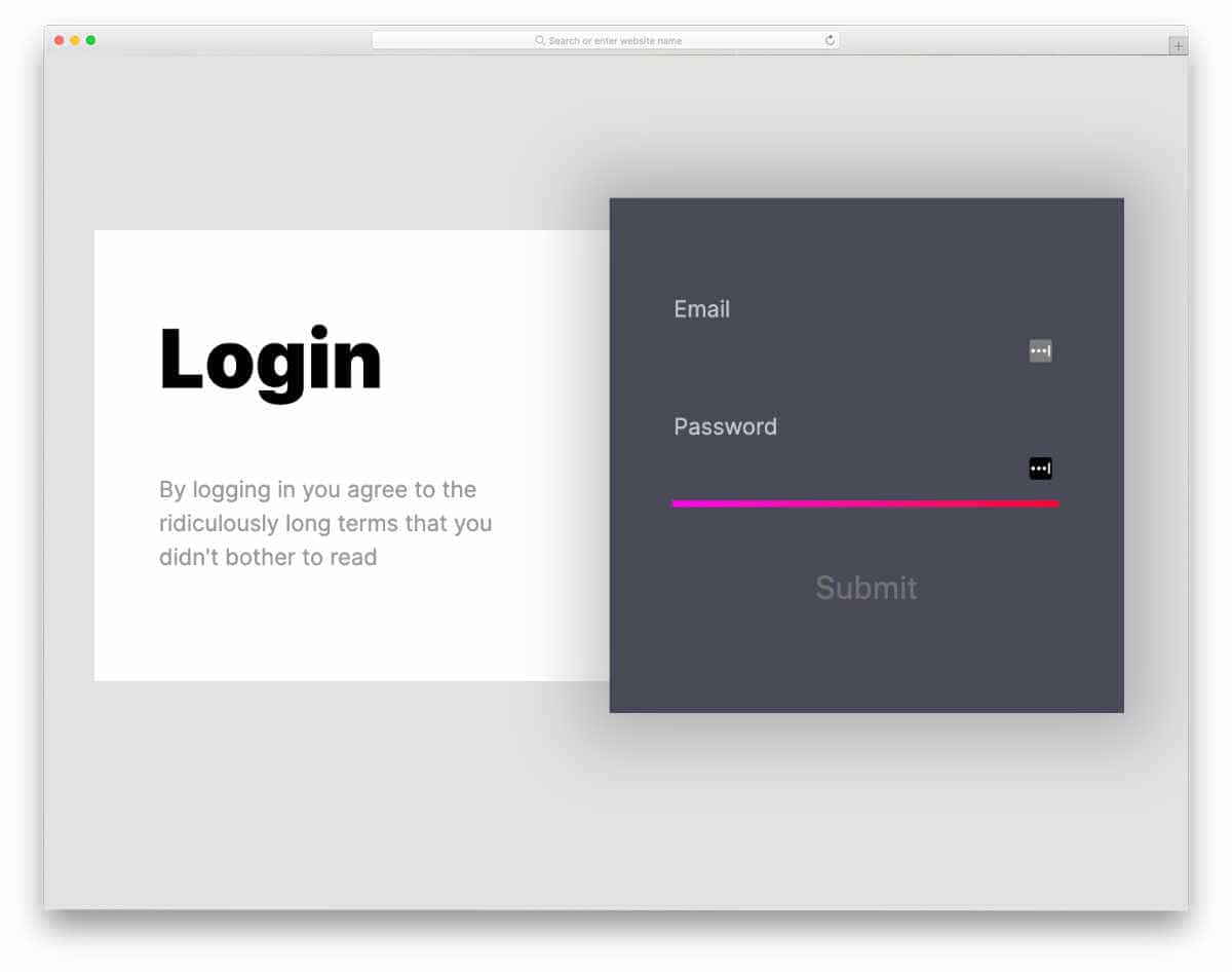
The creator has given this name with a purpose. The line highlighter moves to the next form field like a snake that you might have played in your earlier mobile devices. This snake animation is not pixelated; it is smooth and has a modern appearance. In the default design, the creator has used a login form concept, but you can use it for other types of forms as well. The code script is simple, just like its animation concept. The creator has kept the code script as direct as possible so that you can easily understand the code and use it in your project.
Material Design & Bootstrap 4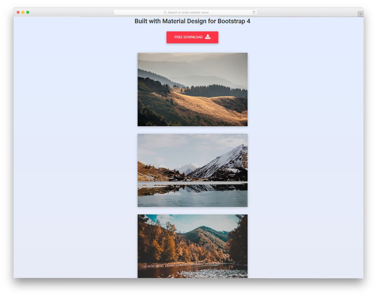
This design is an example of scroll animation. As you scroll down the page, you can see many different slide-in and jiggly movements. For the demo purpose, the designer has used a gallery page design, but you can use this animation for other types of contents as well. Another advantage with this design is it is made mostly using the HTML5 script. Hence, customizing and implementing this bootstrap animation in your project will be an easy job. The whole script used to create all these animation effects is shared with you directly in the CodePen editor; you can edit and visualize your results in the CodePen editor before implementing the code in your design.
Stripped Diagonal Button Single Border
Hover effects are used smartly in modern web design. Elements can serve better and can get user attention easily with the help of animation effects. In this example, the creator has used subtle yet eye-catching hover effects to add life to the buttons. If you are using a brutalist straightforward design for your website, animations like this will give a new look to your website. From the shared code snippet itself, you can see that the developer has mostly used CSS3 script to make this bootstrap animation. Since it uses the latest CSS framework it supports all modern colors.
Button Hover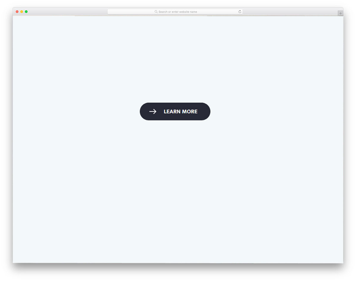
This one is another example of bootstrap hover animation. The hover animation used in this design is fluid and neat. Since the effects are simple you can fit it on any part of the website. The transition not only includes button expansion but also arrow transformations. If you wish to make the arrow animation even more appealing, take a look at our CSS arrow design collection for more inspirations. This bootstrap animation is made purely using the CSS3 script and a little bit of HTML code is used to make the design precise.
Aperture Video Play Button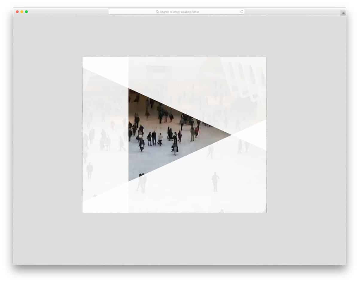
Video contents are dominating the internet and users also love to watch videos on the go. If you are using videos on your website and love to make the video player blend well with your design, this button animation will give you a new idea. As the name suggests, the play button is treated as an aperture on the video background. The transition of the button is quick so that the user can see the videos easily without any interruption. Since the whole concept includes lots of complex elements, the code of this design is also a bit complex. The creator has used HTML, CSS, and Javascript to make this design. By keeping this design as an inspiration you can recreate it with the code structure you prefer.
Button Border Hover Effect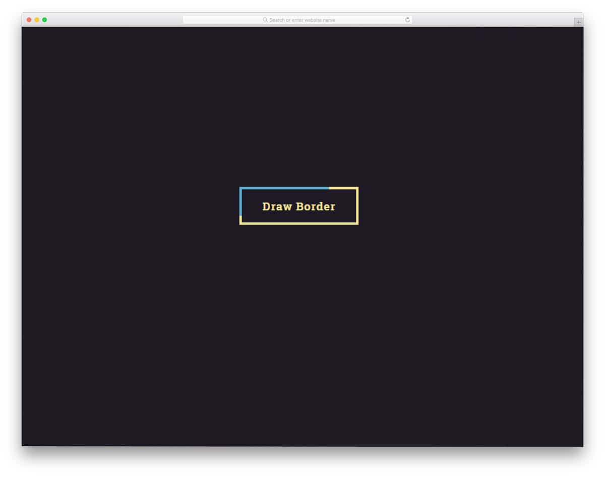
You don't have to animate the whole button, some times you can choose the minimal approach and choose button border animation effects. In this bootstrap button border animation effect, the creator has used a color-changing effect. Since the button's shape remains unchanged, the user knows that there is a button. Only the way the button reacts to the hover is changed in this design. Overall it is a simple design and can easily sit on any part of the website. This bootstrap animation is made purely using the CSS3 script, hence handling this code will be an easy job for both new and experienced developers.
Bounce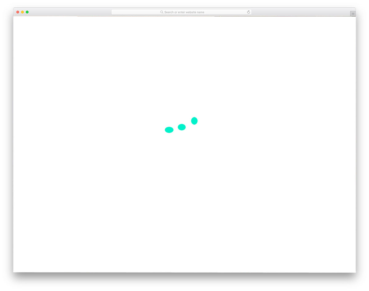
Another most commonly used bootstrap animation is loading animation. Most premium themes and some good quality free templates give pre-loading animation in the default design itself. If you wish to be a little bit creative with the loading animation, this example will inspire you. As the name implies, this animation includes a bouncing effect. The default animation is simple and clean so that you can use it for any type of website. Since the developer has used the latest web development framework, you can feel the fluid effect. Not only the design but the code structure is also kept simple to let you easily utilize the design.
Loader CSS
Rather than using a simple generic loading animation, some websites use elements that are relevant to their design and niche category. For example, in a food website template, you can see foods and vessels in the animation. In this example, the designer has chosen the isometric design in a material design format. The circles smoothly come one over the other and the shadow effect is used smartly to add depth to the effect. This bootstrap animation example is also made mostly using the CSS3 script. If you are following an isometric design on your website, then you can use this design as such without making any customizations.
Spinning Liquid In Box
This one is another simple and elegant looking bootstrap animation. As the name suggests, this animation has a liquid moving in a rotating box. The animation flow is fluid so that the effect gives an authentic look to the design. This simple animation can be used for both web and mobile application. Since it is a light-weight design with HTML and CSS code, it will work smoothly on the computer and mobile devices. The entire code structure is shared with you so that you can trim the code as per your requirement.
Floating Animation
Floating Animation is a perfect example of profile widgets and profile pages. This animation keeps the user's profile image floating so that it is highlighted from the rest of the web elements. Since the effect is simple, you can use this on the widget and as well as on a profile page. Shadow effect is used effectively to give a real floating feel and you can adjust it based on the design you follow. If you are looking for modern profile page designs for your website or your users, take a look at our bootstrap profile page collection.
Arrow Animations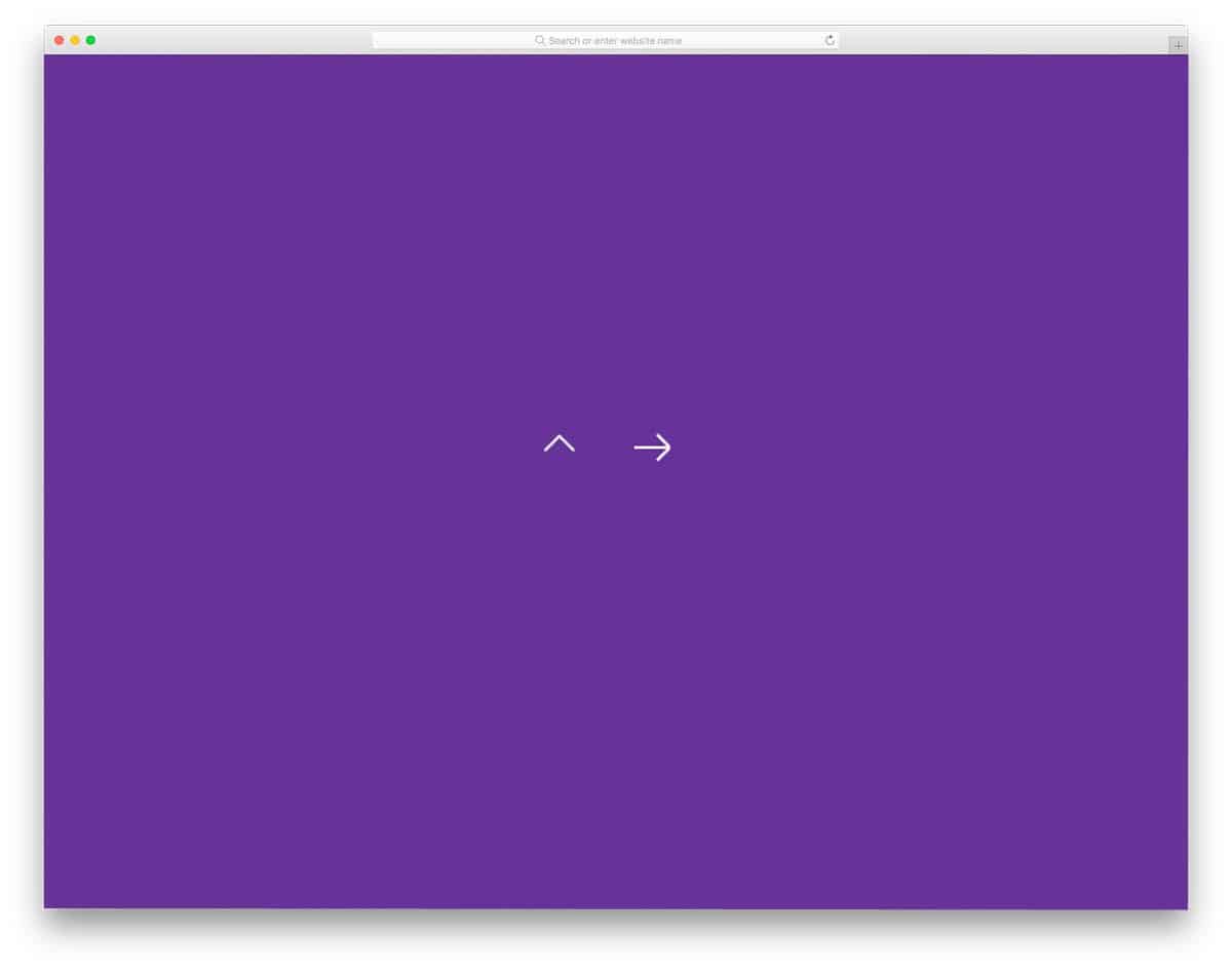
Arrows are an inevitable element in modern web design. Right from smartphone applications to simple websites, arrows are used to guide the users. When the arrows are combined with animations, they become more meaningful and gives a better experience to the user. In this example, the creator has used subtle animation for the arrow click effect. The default design makes it a perfect option for the toggle arrows. The given effect is sleek and quick so the users will barely notice the arrow design transitions. For a buttery smooth animation effect, the developer has used a few lines of javascript along with the CSS3 and HTML5 codes.
Animated Back To Top Arrows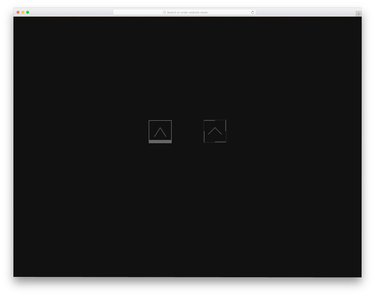
You can see back to top arrows in many blogs and listing sites. Though these back to top arrows are not used much on the desktop design, these arrows are very useful on small screen devices. The user doesn't have to keep on swiping to reach the top of the article, they can simply click the back to top arrow. If you like to animate the arrow and let the user symbolically tell the function of the arrow, this animation effect will be a good choice. Originally this design is made for the desktop version, hence the animation effect is triggered on hovering over the arrows. This simple bootstrap animation can be easily customized and used on any website or applications.
CSS Animated Arrow IconThis bootstrap arrow animation is almost similar to the Arrow animation example mentioned above. But this one has a bouncy effect when you click the arrow. If you are following a minimal website with a colorful design, this arrow effect will fit in perfectly. This arrow is also made for toggle option. Whether you are using the arrow for the accordions or the drop-down menu, this effect will work neatly. Like the design, the code is also kept very simple. Mostly CSS script is used in this design and a few lines of HTML and Javascript is used to add perfection.
Arrow Loading Keyframes Animation
In this example, the creator has used arrow animation for loading effect. But, you can use this type of designs on landing pages as well. Since we have only a few seconds to grab the user attention on the landing page, animated elements like this will help you focus the user attention on the desired content. This effect is more or less similar to the neon signboards used to show the stores. Since this design is made for loading effect, it is not triggered by hover or click action. But, you can customize the character of this bootstrap animated arrow easily by adjusting the code shared with you.
CSS Chevron Arrows
These animated arrows are the best option for carousels and image sliders. On hovering over the arrows you get double arrows showing the slider direction. The whole arrow is designed using the CSS script, hence you can easily customize the arrow size, color, and everything. The entire code script is shared with you on the CodePen editor, hence you can easily edit and visualize the results before implementing the design on your project.
Reveal Animation Text And Image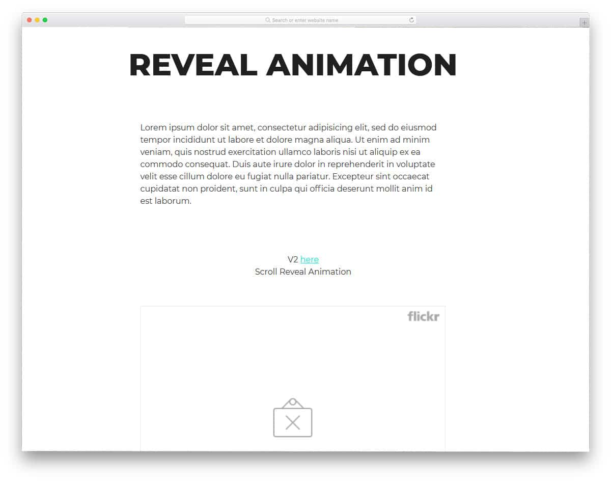
This one is another reveal animation which you can use when the page loads or when the user scrolls down the page. To give you a better idea, the creator has used both texts and images in the demo. Since this bootstrap scroll animation uses a thick color overlay to reveal the content, it can easily handle any type of content on the page. But still it has its limitations, you can't use it for homepage page with pricing tables, accordions, and pages with lots of elements because it will annoy the users. Saying that, this bootstrap reveal animation is good for pages with fewer elements. For example, you can use it in a product description page or your single project page on your portfolio.
Shatter Text Effect
Texts are treated as a part of the modern web design. Thanks to the more expressive font designs we have now. When we combine these expressive fonts with interactive animation effects, it will give depth and character to the design. In this example, the creator has used the hover effect for the texts. From the name itself you can judge it uses a shatter effect. But the shatter effect is handled properly to maintain the readability of the texts. Just like most other bootstrap animation examples in this list, this one is also made using the CSS3 script. Hence, you get the flexibility and versatile character to easily utilize the code in your design.
Direction-aware 3D Hover Effect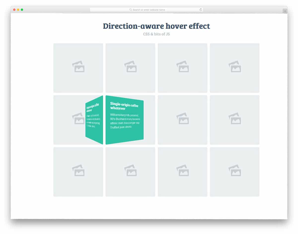
With the help of the modern powerful code scripts, the user experience has become more natural and easy to use. In this example, the creator has used direction-aware hover effect to show the texts. For example, if you are moving from the top, the box unfolds from the top. And if you are moving the cursor from the left, the bold flips from the left. Interactive smart animations like this will add extra elegance to your design. If you are planning to tell a few words of your work on the portfolio, this effect will be a good choice. By making a few adjustments to the code, you can use it on your existing website.
10 Stunning Hover effects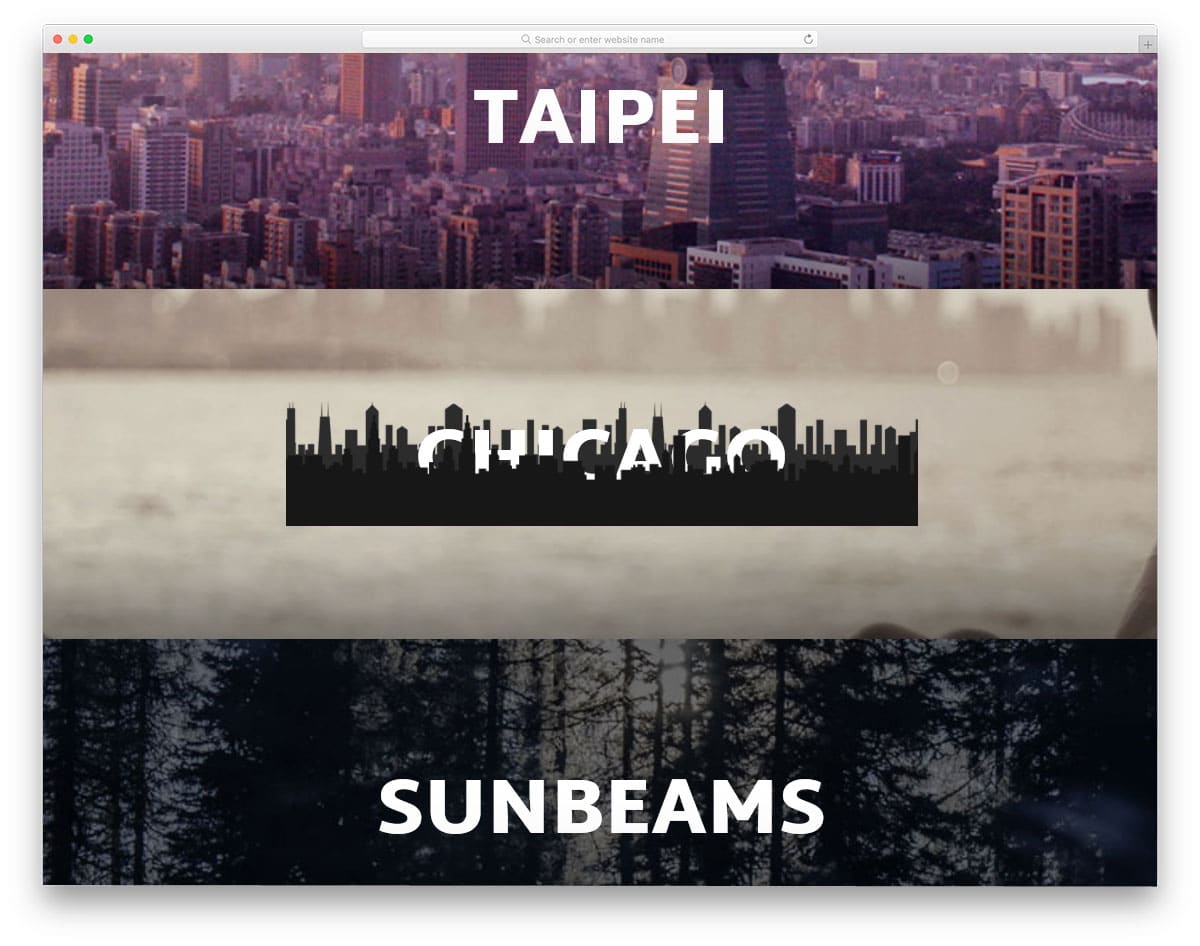
Hover effects don't need to have the same color changing and depth effects. With the help of modern bootstrap animation, you can be more meaningful with your hover effects. In this example, the developer has given us ten hover animation examples that are related to the word. All the hover effect concept given in this example is minimal and loads quickly, so you needn' worry about the page load time. Another notable feature in this example is it is made completely using the HTML5 and CSS3 script. Hence you can easily utilize this code even in your existing website.
Image Hover Effects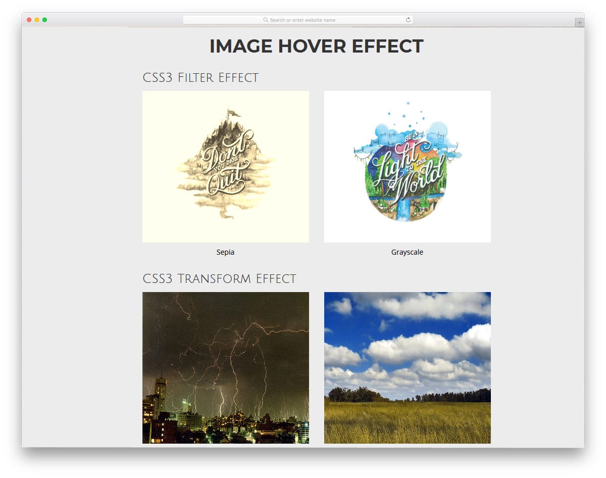
Image Hover Effects are one of the most commonly used bootstrap animation effects. In this example, the creator has given us color overlay effects, zoom effects, and text effects. All the animation effects are simple and don't take much time to load. You even get a 3D card flipping effect in this example. If you are looking for gallery designs with smart animation effects like this, take a look at our gallery page design collection. In this example, you get nearly seven hover effects and all of them are made purely using the HTML5 and CSS3 script. The code script used to create all seven hover effects are shared with you in CodePen editor. You can edit and visualize the result in the editor before using it on your website.
Border Animation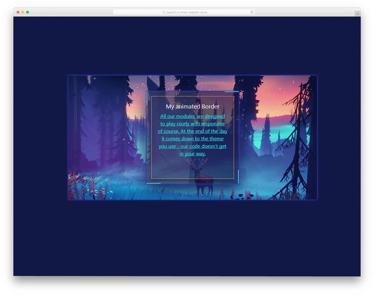
Border animations are used effectively in the modern web design to distinguish the important elements from the others. Especially if you are making a website with lots of card elements, border effects like this will come in handy. In this example, you get a continuously animated boundary and a hover effect as well. The given animation is simple and light-weight, so you needn't worry about the page loading speed. The simple code structure of this design makes it fit easily even in an element and content-rich web page.
Free Blogger templatest, Free Blogger templates Minimalist, Free blogger templates responsive, Layouts blogger, Simple free blog template, Blog template WordPress, Goyabi templates, Nawigacja na stronie, Free Blogger templates, Free Blogger templates Minimalist, Btemplates, Free blogger templates responsive, Simple free blog template, Blog template WordPress, Blogger template responsive free, Blogger templates,s Free Blogger templates Free Blogger templates Minimalist Layouts blogger Free blogger templates responsive Btemplates Blogger portfolio template Blog template WordPress Free themes blogspot Theme Blogger Premium Gratis Download Parhlo Premium/Magazine Blogger Template Google Infinite AMP Responsive Blogger Template | Blogspot Infinite AMP Sarkari Result WordPress Theme Free Download Amalia • v1.0 - Responsive •Blogger Template Amalie • Blogspot TemplateCodeify v1.0 - Personal Blogger Template new blogger templates, best blogger templatesLuvblog - Responsive HTML5 Blogger Template Twitter Bootstrap 3.0 100% Responsive DesignCream - Responsive News & Magazine Blogger Template Cream Magazine | ThemebeezSeo Mag - Responsive Blogger TemplateBest - SEO Friendly Blogger Templates • Top Best Free • New TemplatesWaverly - Personal Responsive Blogger Template250+ Best Free Responsive Blogger Templates PackNewsify v1.0 - News NEWSIFY BLOGGER THEME FEATURES Magazine Blogger Templateresponsive blogger templatesprofessional blogger templates freefree customizable blogger templatesfree blogger templates simple blogger templates freefree html blog templatesclean blogger templatespremium responsive blogger templates
Comments
Post a Comment