25+ jQuery Accordion Examples To Organize Text Heavy Pages & Sites 2020
There is a reason for the popularity of accordions surging so much over the years! For those larger and text-heavy contents, the simple and effective way to make it more appealing and less boring are accordions or collapsibles. Basically, it works by limiting the display of the contents to collapsible menus that users can enable or disable. The basic structure is usually multiple items including the head/titles and the body that expands on command. It is an immensely useful pattern to highlight important details of a specific section utilizing progressive disclosure.
But who says these need to be plain and boring? With access to animating and stylizing with custom codes, the site-owners can get as creative or as simplistic as they wish it to be! And if you are one looking for a kick-start onto the amazing and innovative ideas, then this list today is surely a great place. Combining all of the free options online where you can get ideas for bold, professional-looking and stunning examples, today we have a list of best possible jQuery Accordions for you to enjoy! Hand-picking out these variations, the best part about it all is that you also get access to their full coding structure. And if there are more CSS elements like cards, buttons, dividers and more you are interested in, you can check out more of our posts on the blog.
JQuery Accordion Navigation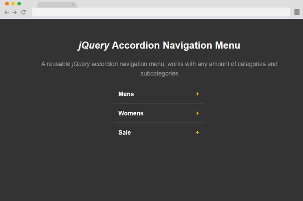
The top on our list features a simple and easy jQuery accordion navigation menu that is pretty impressive and smooth with the movement. It is great as this particular sample you will find the option to add in any number of categories and subcategories. The color schemes are kept to the minimal making the titles the basic focus here. When clicked on the icon next to the title, it is animated to display the accordion and the contents inside. Elegant, dark and clean, this sure is a great way to add a navigation atop your site. And being pretty flexible with the structure itself, you can start with this canvas and further customize it to your own preference.
A Pen by Duke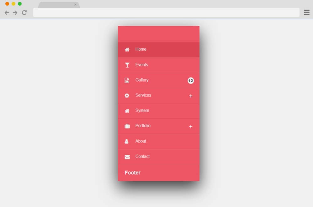
Another advanced navigation menu designed with jQuery acccordion is this pen by Duke on codepen. It is a pretty visually impressive design as the creator here has absolutely left no stones unturned. Each and every component is designed with a purpose and is animated is such a smooth transition. It features a simple menu, and a vibrant color to represent it. Even the shadows are added to add that extra realistic touch. Each of the tab features a icon and the title and for the ones with accordions inside another icon on the lefty hand side. When clicked on the animated icon, along with it's transition it also reveals the categories inside. The categories also depict a change in background color when it reveals itself. Overall a pretty impressive take on a simple concept of a navigation menu if you ask us, we definitely think this was worth a mention here.
jQuery (UI-less) Accordion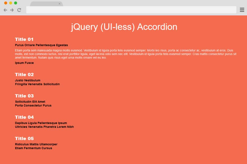
Next in line we have another accordion design that is designed with a simple and minimal touch to it. It basically features various texts as the sections for the title, subtitle and the revelation to another paragraph as the content inside the accordion. The use of eye-catching color scheme with simple design to the texts is sure to catch your users attention as well. Each of the categories are also animated to showcase one at a time, which means when you select one, the others retracts itself.
JQuery Accordion by Vikas Verma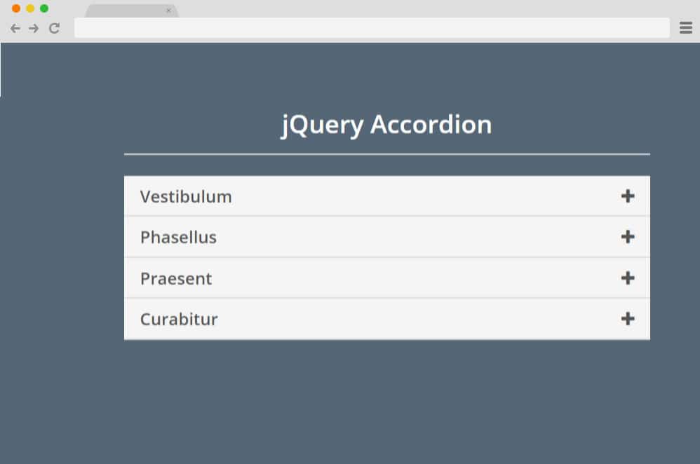
Let's start out our list with a simple example by Vikas Verma. Designed with simplicity and clean aesthetic in mind, everything about this appeals to the users. From the gray and white color pattern to the use of simplistic icons this is a great way to add stylize the components on your site. HTML is used to define the structures, contents and shapes while the simple JS and CSS are used to add in that smooth transitions. Now, with the accordion when clicked on the specific sections, it expands to display the contents inside. The little details with the color change and the icon changing its shape is what that makes it so interesting. Subtle yet completely purpose-oriented, this leans out to a more professional and clean design overall.
Simple SASS jQuery Accordion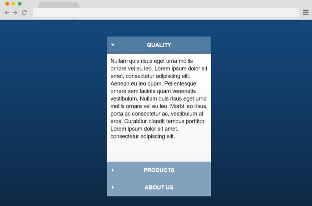
Now for a more complex design per se, this is a more advanced and stylish animated jQuery accordion design. A pen by Jon Stuebe, this design utilizes SASS as well as Jquery codes to implement the smooth transition and placements of components. Unlike the traditional design where the accordion starts out with all of the contents hidden, this design uses the effect similar to a radio button. When one of the title is clicked on to reveal the content inside, the previous option automatically retracts. Everything about this is quite mesmerizing as the creator has taken in the subtle details seriously. Depending on the title clicked on, the menus slide up or down to reveal the content. The icons alongside the color scheme of the selected title also changes to highlight the selection. Even the shadows and lighting plays a part in giving it a more materialistic feel.
4Line jQuery Accordion
Now this is a more minimal and simple design of a jquery accordion if you are looking for one. The creator has given anyone a head-start if they want to add in their custom touch as the overall styling and design is pretty plain. The accordion however works pretty smoothly. And as the name suggests, the whole structure is based on 4 simple lines that works as the borders for each title or the content. Easy to implement and replicate if you wish, with a few tweaks here and there you can make it into your own design. Follow the link below to get access to their full coding structure.
Rotating Arrows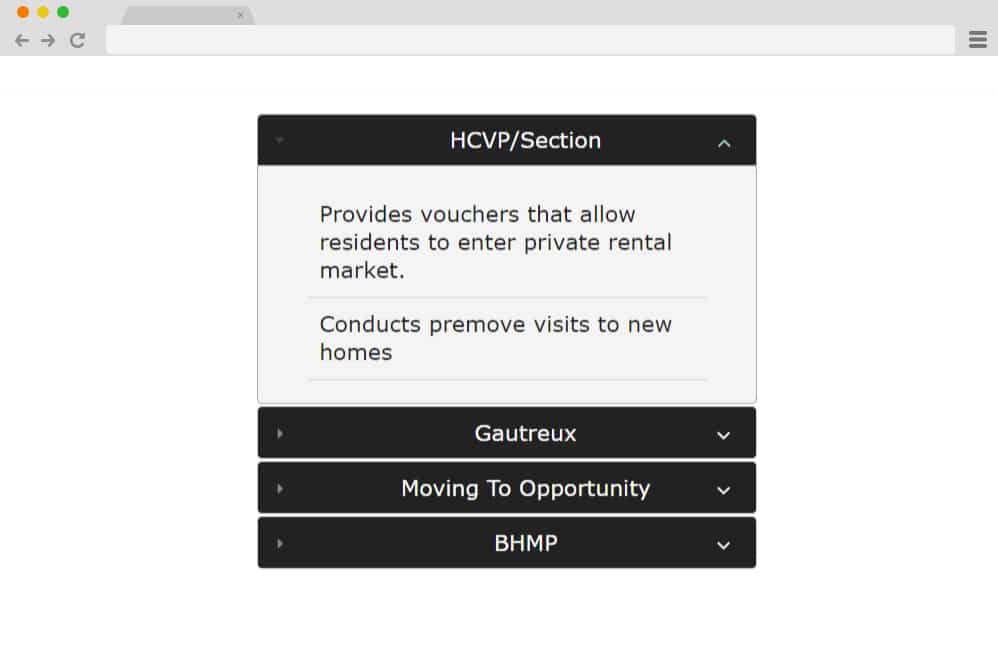
Another one in the black and white color scheme, this is a more advanced and complex option. The simple accordion is defined by four black boxes each expanding with a click to reveal the content inside. But as the name suggests, the focal point here are the rotating arrows which changes their placement when highlighted. The sections are also divided into more than one with a divides between each point. Overall, the design aspect is kept minimal yet modern with the fonts, color schemes and the whole structure. Combining HTML, CSS and jQuery, the creator of this example has played with simplistic features to get this stunning variation.
Sexy Accordion
Talking about clean and neat designs with black and white color schemes, this one falls under the same niche. However, instead of the box design like the most of our examples listed today, this also uses the 4 lines to designate each collapsible sections. The rotating on the left hand side also adds that subtle hint of creativity. Combining simplicity with the whole accordion, this design is versatile and works with almost every possible site. While all of the elements and their styling is pre-defined, you can easily add your own custom touch with a few changes here and there. So why start entirely from a blank canvas when this free option can give you a head start.
Responsive Blue Accordion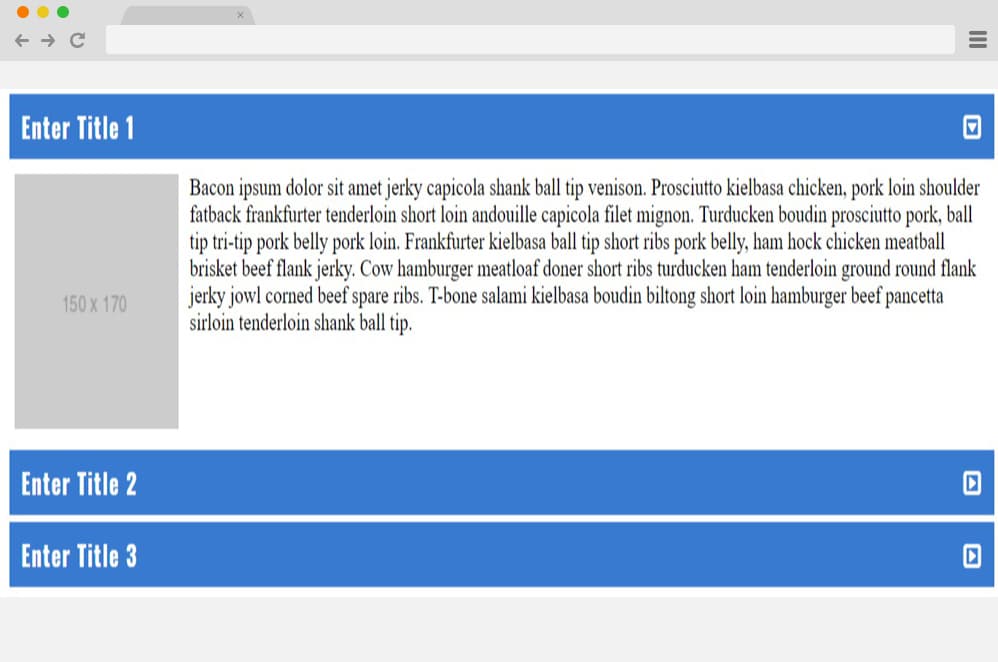
One of the major feature of an accordion is surely the responsiveness it can feature. And this design is surely a great implementation of that. Adjusting to any screen size whether small or large, this blue accordion dictates the stylish appearance. The boxes representing the expandable sections also hold placements for images which is a unique concept. While the blue and white color schemes are pretty much appealing, you can easily change it to match your preferences. The rotating arrow for a more interesting detail is placed inside a square. Overall, quite impressive, easily get the full access to the codes through the link down below.
Simple Accordion jQuery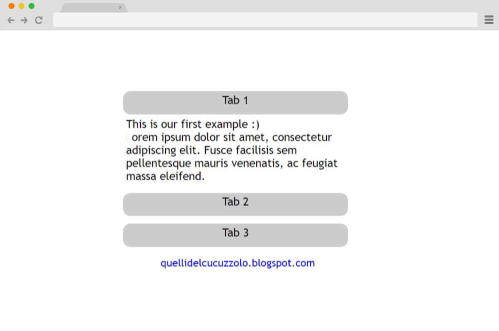
Utilizing the classic tab based designed, this jquery accordion is simple, effective and pretty professional looking. The simple background with the gray button like tabs works as the title holder for the accordion. These tabs when clicked on is animated to expand like an accordion. Using simple HTML and CSS the style is kept aesthetically pleasing and flexible so you can also add in your own custom touch. Get access to their full coding structure down below through the link we have listed below.
Responsive jQuery Accordion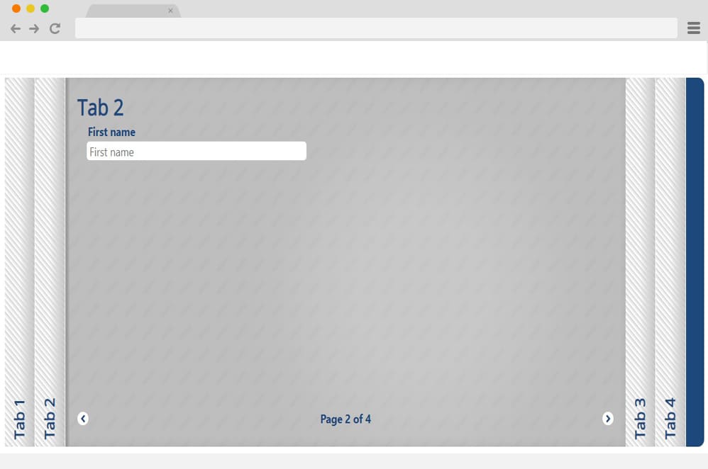
Talking about responsive and creative designs, this is a unique and pretty innovative concept. Unlike the most of the examples on this list today, this is a horizontal view to the accordion. Not only this, but on the complex side, the design and the overall animation is also a stunner. Using various gray, white and blue patterns on each of the sections, the style is modern and edgy. And if you are one to go after something different, then this responsive jQuery accordion ticks off the box. Unlike the classic slide up and down, this makes use of the slide left and right changing direction according to the tab clicked on. Two easy navigation icons are also placed on the bottom of either side for the users. Little details like page numbers, titles, shadows and lights are used in a creative way.
3D Accordion
This is a more interesting and impressive design created to replicate a 3D design. And if you are one to opt for a more creative and stylish approach than this one is definitely for you. The creator has used images as the accordion sections which unfolds in a 3D effect to reveal the content inside. Another small detail that keeps things interesting is the hover effect which reveals additional details added on the title. The content sections are also designed with material design giving it an almost realistic paper feel to it. Each of the images are placed horizontally one above the other. The whole structure is based on the CSS, HTML and JS to achieve the end result. For a closer look on the codes used, follow the link below.
Super Simple Accordion
Coming back to something more neat and on the cleaner side, this is a super simple jquery accordion for those looking for it. The background is plain, however, the accordion with the animation and smooth hover effect is what makes it interesting. When hovered over each of the section, the color transitions to a bright red shade. The content section is pretty versatile as you can add in any type of content you wish. This includes texts, images, links or pretty much anything you want. When clicked on any other section, the previously selected section returns to its original position to make way for the next one.
jQuery Accordion By Andrew Hodgson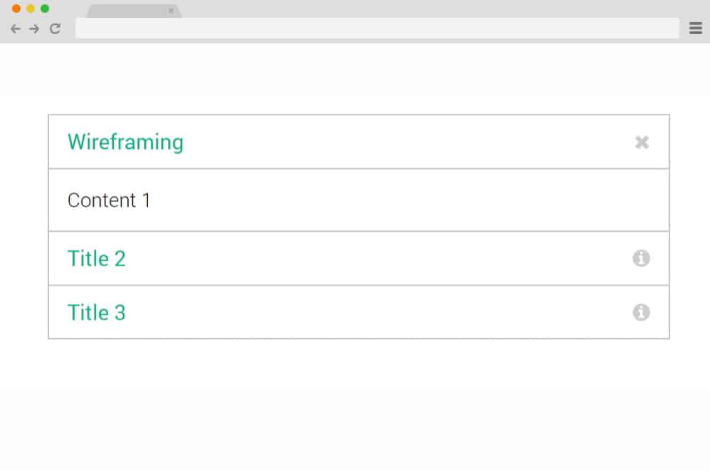
Making use of simplicity and plain design, this is another stunning option to implement jquery accordion onto your side. Although the style is pretty minimal, it still is a great option. Why? Because each of the sections are styled and animated to perfection for a smooth performance. The boxed section slides up and down to reveal the content inside. On the right hand side the information icon also changes to exit or cross section which returns the whole structure to its original placement. With a few tweaks here and there, you can easily change the fonts, color schemes and the sizes easily if you prefer.
Really Simply jQuery Accordion by Jen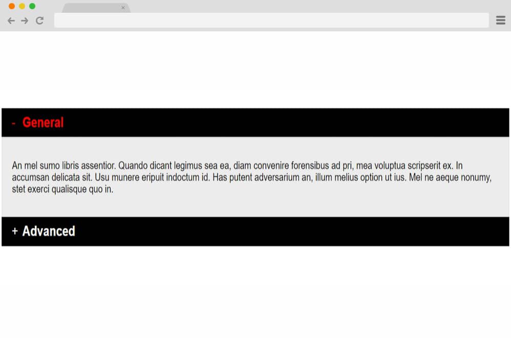
Another one that pops out from the rest is this amazing jquery accordion example by Jen. Keeping it really simple and minimal, this is the perfect example to showcase how something so simple can be so effective. The black boxes stand out in the white background and the smooth transition with its placements is really impressive. Even the texts are animated to change their color scheme to highlight the selection while the rest of the content displays itself. Using HTML, CSS and a bit of Jquery, you too can create the same effect. Simply follow the code through the link below and get a head start on the project!
Accordion by Michael Hoffman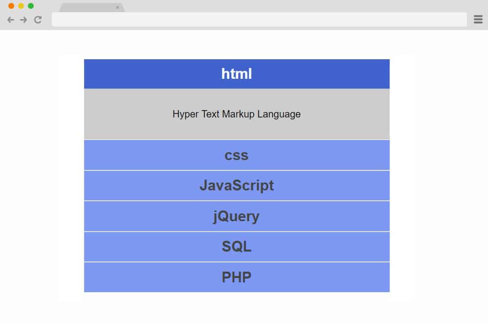
This accordion by Michael Hoffman is another professional looking example that you can easily get access to through the link below. The blue and accordion uses the black fonts on each of the boxes. However, the selected section changes the font color to white. Quite simple to achieve, this is an easier option you can get started with. The codes are all clean and well-commented so that you can easily understand the whole structure. Another subtle detail added is the color changing from a lighter to a darker shade when clicked on to highlight the selection.
CSS JSS Multi-level Accordion
Now for more practical and functional design, this is a multi-level accordion which means that it holds accordion inside the accordion. The simple blue and white color palette makes the design elegant and simple. However, the multi-level design is what makes it stand out from the rest of the examples on the list. When clicked on a specific section it reveals more option to expand which also expands to the third level of the accordion. Although this is simply a demo, you can use it for your site with ease customizing any details according to your preference. Each of the sections also executes a simple hover effect. Another unique feature is that each of the collapsible menus stays intact no matter how many options you expand. In our opinion, this is pretty much a great option for any text-heavy sites or pages.
Sassy Accordion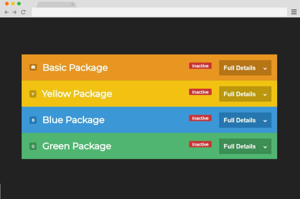
Colorful and attractive in all ways, this is a more engaging design to add in jquery accordions onto any site. Whether you want to use it for branding, promotional or creative purposes, this is a great option. Who could have thought that a simple design can be elevated to a whole another level with only use of multiple colors? In addition to this, various innovative components included including the button, texts area as well as the icons add to the appeal. When clicked on, these sections expand or slide down to reveal the rest of the content. Using HTML, CSS and a bit of JS, the end result is surely worth a try.
Simple jQuery Accordion by Victor Diaz de Leon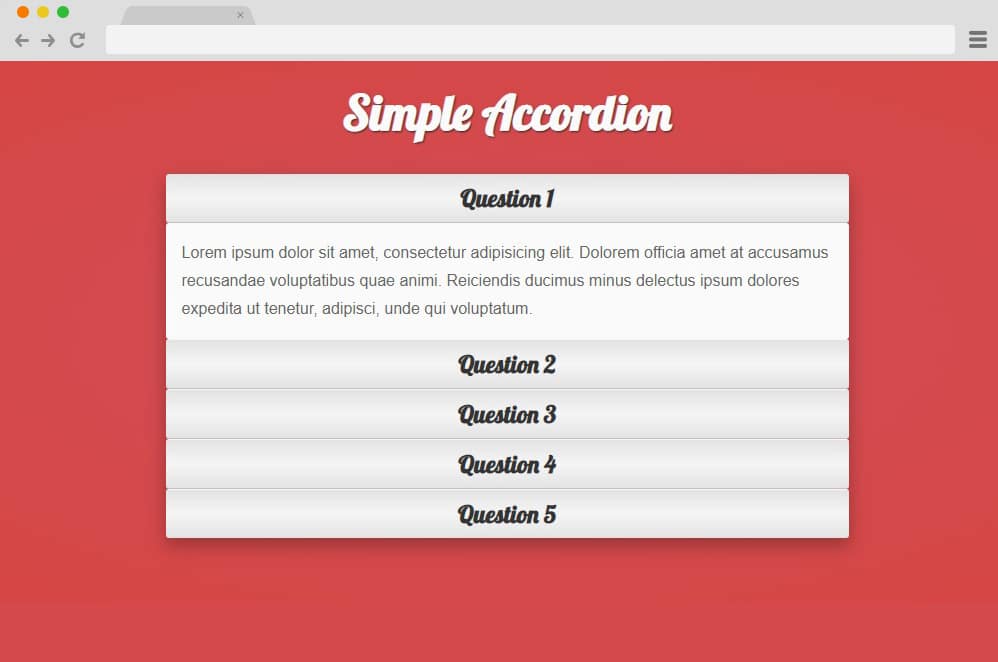
Another one under the simple and elegant niche of an accordion is this style by Victor Diaz de Leon. The material design based boxes are animated in such a way that it is visually stunning. The grayish white over the red background also works extremely well together. Using CSS, and JS each of the sections execute a stunning accordion movement and transition. The whole styling factors including the color schemes, fonts used and even the patterns are pre-defined. However, you can make this design yours and add custom details with a few changes here and there.
Accordion Toggle
Making use of the toggle style with accordion, this is yet another great way to add accordion to your website. Elegant and clean with the whole design, the blue and white color scheme makes the whole thing even more attractive. The toggle style design expands in a smooth slide out effect revealing the content inside. Fonts, and the overall styling factors are kept minimal to focus on the content revealed. And unlike most of the examples on our list, this follows the simple 4 line structure rather than boxes.
Easy Accordion
Another one on the more creative side is this super simple yet stylish jquery accordion by Rasmus Bihl Larsen. Contrasting color with black on yellow makes it look more edgy and retro. Each accordion tab is represented with separate boxes holding the contents inside. When clicked on, the rest of the content reveals itself in a smooth slide in effect. The rotating icons on the right-hand side also add to the appeal. Keeping the smallest details in mind, the design is also based off on material framework giving it a more realistic touch.
Easy CSS jQuery Horizontal Accordion
If vertical accordions do not cut it out for you, then this example here is a great option for you. Unique concept combined with innovative design elements, the creator has kept the whole aspect visually appealing. Each of the accordion tabs differs in color with 5 of total colors used. And unlike the traditional accordion, this design leans towards the horizontal movement. It basically acts by sliding in and out of view depending on the tab clicked on. The contents when revealed then turns itself to a vertical view to asjuts to the users view. Using CSS, HTML and JS, this although complex to get at the first try, is still worth a go if you want to stand out.
Accordion & Search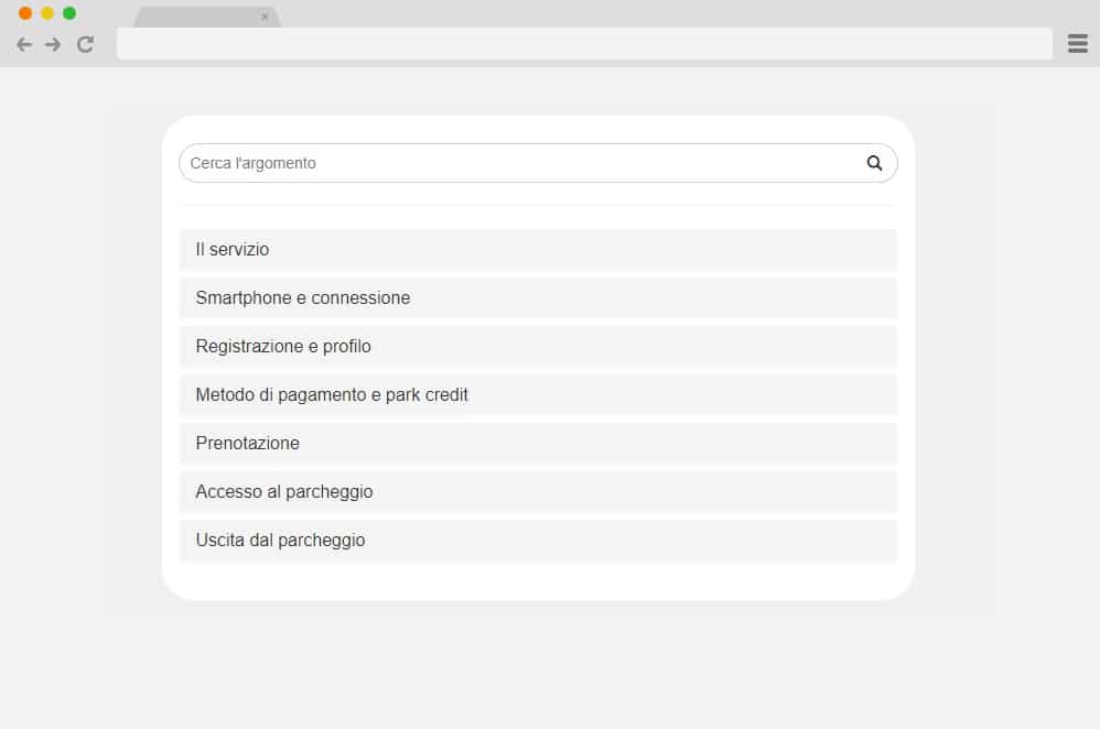
For more effective and efficient use, this is a combined version of both the search bar and accordion into one. Keeping the whole format clean and minimal, the style is more purpose-oriented. A search bar is placed atop for easier navigation and the accordion is subsequently placed under the bar. Even the accordion is also multi-level which means that it has accordion inside accordions. The sections represented with boxes expand to reveal links like section which further expands to reveal the content inside. Search bar is also equally functional and users can make use of it to easily find the title they are searching for.
A Simple JQuery Accordion with Unlimited Nesting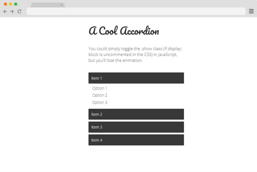
If you are going for something more minimal and simple, then this is another great way to implement jQuery accordion onto your site. The whole structure is visually clean and elegant. With a number of toggle buttons that expands on click to reveal the contents inside, it is a pretty straightforward design. The content sections are designed to simply slide down and also work like a traditional toggle. This means that only one catrgory can be displayed at the time. The buttons also have a subtle hint of hover effect with a slight color transition. Great thing here is that the template is also pretty responsive and responds according to the screen size of the devices your users are using.
Responsive Accordion
Now this is a more creative use of jQuery accordion concept that ends up as a eye-catching element. A horizontal slider based design, the creator here has used awesome looking images as a base. At a first glance, it is basically a line-up of images showing just a peek into each of them. However, when hovered over, these slides expand to reveal the full images for the users to see. Each differ with the slide effect depending on it's position. One can add in extra contents inside each of the slides whether it is the title or the description. The great thing is that this template is completely responsive which means that it automatically adjusts to every device screen size with ease.
Material Design Accordion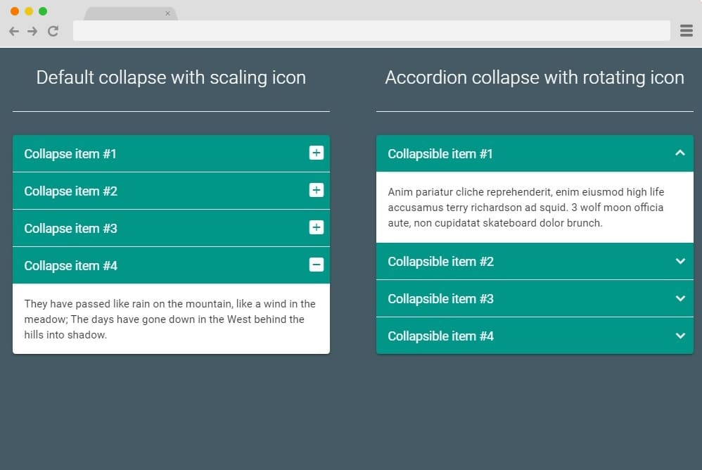
As the name suggests, this is a jQuery accordion that follows a simple material design with the styling. There is a play with the elements here and there are two different variations to get inspired from. It starts out as a simple table of contents with descriptions and title holders inside. When clicked on each of the components are animated to slide down to reveal the whole structure. The panel also contains a revolving icon that transitions when the table reveals and collapses. All in all a simple, effective and pretty appealing design we definitely think this is worth a try. Get a closer look on the whole structure through the link down below.
Free Blogger templatest, Free Blogger templates Minimalist, Free blogger templates responsive, Layouts blogger, Simple free blog template, Blog template WordPress, Goyabi templates, Nawigacja na stronie, Free Blogger templates, Free Blogger templates Minimalist, Btemplates, Free blogger templates responsive, Simple free blog template, Blog template WordPress, Blogger template responsive free, Blogger templates,s Free Blogger templates Free Blogger templates Minimalist Layouts blogger Free blogger templates responsive Btemplates Blogger portfolio template Blog template WordPress Free themes blogspot Theme Blogger Premium Gratis Download Parhlo Premium/Magazine Blogger Template Google Infinite AMP Responsive Blogger Template | Blogspot Infinite AMP Sarkari Result WordPress Theme Free Download Amalia • v1.0 - Responsive •Blogger Template Amalie • Blogspot TemplateCodeify v1.0 - Personal Blogger Template new blogger templates, best blogger templatesLuvblog - Responsive HTML5 Blogger Template Twitter Bootstrap 3.0 100% Responsive DesignCream - Responsive News & Magazine Blogger Template Cream Magazine | ThemebeezSeo Mag - Responsive Blogger TemplateBest - SEO Friendly Blogger Templates • Top Best Free • New TemplatesWaverly - Personal Responsive Blogger Template250+ Best Free Responsive Blogger Templates PackNewsify v1.0 - News NEWSIFY BLOGGER THEME FEATURES Magazine Blogger Templateresponsive blogger templatesprofessional blogger templates freefree customizable blogger templatesfree blogger templates simple blogger templates freefree html blog templatesclean blogger templatespremium responsive blogger templates
Comments
Post a Comment